About this book
This book concerns the software program Scribus. There were a number of objectives which the authors set for themselves:
- To allow a quick overview of the program for both novices and those experienced with layout who professionally make use of PDF (Portable Document Format).
- To present a sensible approach to the various features of a PDF, so that a proper workflow is utilized, with a rapid, flexible creativity, and yet which assures a professional final result. This manual approaches the task in a progressive way, so the reader is encouraged to follow the sequence of the sections.
- To permit French-speaking users (see below) to have access to a manual in their native language. This facilitates comprehension of professional concepts which at times are complex, as part of the development of a community of French-speaking users of Scribus.
- To offer a documentation which is not only immediately available, but due to its location in a wiki environment, allows for its own progressive development as needed.
The bulk of this work of 200 pages was accomplished in a Booksprint lasting 5 days, which occurred during a meeting in Strasbourg on July 6-10, 2011, thanks to the sponsorship of l'Organisation internationale de la Francophonie (www.francophonie.org).
This comes about from the popularized experiments of the Floss Manuals Foundation as part of a framework of creating multilingual manuals on free software and other free materials, where the methodology of the Booksprint results in the creation of high-quality books in a very short time. Floss Manuals Francophone is an organization stemming from the 1901 Act, whose objective is the organization and facilitation of writing in or translation of documentation to the French language.
A group of six co-authors (trainers, designers, developers, and printers), coming from North America, Europe, and Africa worked together in order to represent the various kinds of French-speaking users.
The co-authors at the Booksprint were:
- Camille Bissuel (France)
- Magaouata Dan Bourgami (Niger)
- Louis Desjardins (Quebec, Canada)
- Cédric Gémy (France)
- Thibaut Hofer (France)
- Alessandro Rimoldi (Switzerland)
In addition, there were two facilitators:
- Elisa de Castro Guerra (France)
- Anne Goldenberg (Quebec, Canada/France)
Collaboratively written, this book on beginning to use Scribus derives its inspiration from the values of freedom. It is available on the Floss Manuals site in a variety of formats: printed book, web pages, PDF and ePub, this last one permitting the easy review on an eReader or other portable electronic display. Published under the dual licensing of GPLv2 and Creative Commons-ShareAlike (CC-BY-SA 3.0), this manual may be read and copied freely. Otherwise, the content of the electronic version is expected to evolve as the software advances. To view the most recent version, you are encouraged to regularly visit the Francophone section of Floss Manuals (http://www.fr.flossmanuals.net/scribus).
Please do not hesitate to help improve this manual by making your comments to us in the francophone list at Floss Manuals. If you have decent writing/editing skills and are knowledgeable about Scribus, we encourage you to register on the site so that you might suggest new chapters or edit existing material. You will find at the end of this work a list of those who have contributed to this work up to its current version.
You are reading the version revised and enhanced as of December 1, 2011.
About this translation
The main goal of this English translation was to try to capture the flavor and spirit of the original but at the same time try to write as if it might have been originally written in English.
It's also understood that this translation from the original French may contain some alterations, corrections, or enhancements to try to improve the comprehension and accuracy of the material.
Gregory Pittman (US), 2013
Archiving documents
Here we're going to discuss another aspect of working with your documents. Your document and its layout consists of material from a variety of sources, not just the images and the text, but also the particular fonts you may have chosen. Just as it's important to organize and plan these aspects of your document before you begin your work, you must also consider how these are best archived and transferred. What are the issues?
Why archive?
To fully understand the purposes, consider these points and situations:
- Images are not included in the Scribus file (except for some simple graphics). Scribus only stores the path to the image file, and this is a relative path, related to the location of the Scribus file on your computer. On another computer, this may be a different relative path, and especially on Scribus running on different operating systems, the file structure may be quite different. If you move either the Scribus file or the image file, Scribus will not find the image.
- It is most unlikely that two different computers will have all the same fonts available. Thus, someone bringing up your file on a different computer may get a font substitution, and the layout be severely disrupted.
Furthermore, color profiles should be the same from one computer to another, and may or may not be available.
In the archiving process, Scribus can bring all these elements together, so that a concise path structure is created, with all the necessary elements.
Where and how is this useful?
So saving a Scribus file is only a small part of this process, and this is quite different from exporting, which transforms the document into some other noneditable format (at least not editable as we are able to edit the content and layout within Scribus).
Archiving will be useful for:
- Keeping a particular state of the work at some point in time;
- Archiving the document for some future use;
- Sending the document to someone who may edit it, but on some other computer;
- Using the document yourself on another computer ...
In short, any time you do not have an identical environment, file structure, and resources, archiving is highly useful if not essential, and at the very least, saves considerable time in trying to duplicate the environment and the necessary resources.
Archiving
Conceptually, this is simple, but does require some concentration to perform the correct steps.
- Create a folder for the archive;
- In Scribus, select File > Collect for Output;
- In the dialog select this folder (the dialog only accepts directories);
- In this same dialog, select to include fonts, and color profiles if needed;
- Click OK, and Scribus saves your selected items all together in this folder. Note that a copy of your images will be in this folder and all the paths will be adjusted appropriately.
- If you wish, you can then compress this folder with zip or some other utility so that it can be sent as a single file to your colleague, or yourself on another computer.
- Once saved on the other computer, unzip the file, which recreates the same folder structure. When Scribus opens the file, it will of course be looking in that folder for the images, but also will search that folder for any needed fonts and color profiles.
Begin at the end
You may be tempted at this point to simply begin by starting your layout – you have your photos and text, and above all, you have Scribus for making your layout. Why not just dive in and begin? The reason is that in order to get the best results (and waste less time in the long run) you want to consider the entire project, its workflow leading to the PDF creation, and even the printing.
There are a number of technical settings and decisions at the beginning which will greatly affect the success of your project. Having to undo and then redo is wasteful of your time and effort, and in some cases difficult. For example, if you plan on printing the final product on your local printer (the one connected to your computer), this presents limitations on paper size, and secondarily such issues as bleed, binding widths, and the sort of paper you might choose.
In case you see some terms in this section which you don't understand, these will be explained later, and there is a glossary at the end.
Talk to your printer
Of course, we're not talking about that piece of machinery attached to your computer, but here we mean the person at the print shop where you may have your PDF printed. Although many will think about this only after they have completed their project and created the PDF, be forewarned that you may only find at that time that some important choices about color, the format, or the choice of paper could cause you to go back and make some essential alterations. Consider your printer a resource on the physical creation of your work.
Fold some paper
Just as we did in the chapter Hands on, make a simple physical model of your project. By folding the paper as in your final brochure you can easily determine the spaces you have to work with and how they interact with each other. Notice how we used the guides to help us define the spaces available.
If you are making some sort of book, the type of binding is determined by the number of pages. A large book will have to have some type of square backed binding.
Make a timetable
Even if you are solely responsible for content and layout, factor in the printing process time as you look ahead to your deadline. For a short run (small number of copies), a digital printing process is probably a good choice, but for a large run, you might be more interested in offset printing. In that case, there is more work involved in the pre-press work, as well as setting up the machine and scheduling when it will be printed.
Finally, some other issues are important as well, such as the type and availability of the paper you wish to use, how this affects the final look of the project, and even the weight of your book, plus packaging if it must be shipped – essential to know if you will be distributing by mail.
So now you can see many variables outside of the design which impact considerations for the project as a whole. Especially when you consider some deadline you may have, backtracking can be either very expensive or impossible.
Choosing colors
If you were going to make a layout for a book only consisting of text, you may not consider color, but for most page layouts color is an important feature. Many text layouts at the least use color to highlight the text, or even applied to the fonts in some areas. There are a number of color palettes included with Scribus, but in addition you may edit, remix, or add colors to create your own sets of color palettes.
Color models
The set of colors you may use depends on by what method the colors are created, and how they will be viewed by the reader of your work.
Gamut
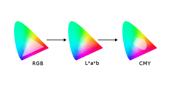
Although you might consider defining colors as only those which the human eye can see, you first must realize that the eye does not perceive all possible colors.
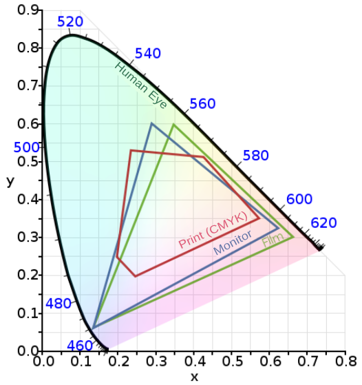
This graph is a depiction of the boundaries of human eye perception, an RGB computer monitor, and CMYK. In particular, consider the limitations imposed by generating a layout in RGB, then printing this in CMYK.
RGB
Nowadays we are highly familiar with this color model, since it is the one used in computer monitor displays. From the elemental colors Red, Green, and Blue, we use an additive process to create a balanced (gray) color, which at its highest brightness will approach white.
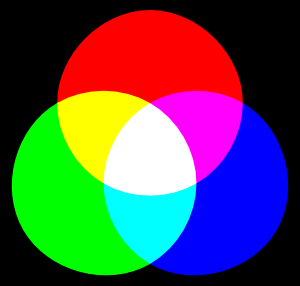
The RGB model offers a very wide gamut of color, some theoretically beyond human perception. As computer monitors improve, there is an increasing ability to display more of this spectrum. At the same time, a designer working in DTP for print must remain aware of limitations of print, and avoid extremes of hues.
CMYK
The CMYK (Cyan, Magenta, Yellow, and blacK) color model is of course the basis of printing, where these colors of ink are often used. Ink color is subtractive, since for example, a magenta ink is absorbing light, but reflecting that which is perceived as a magenta color. If you add cyan, you also absorb the light which cyan ink absorbs, so even less is reflected. The correct balance of cyan, magenta, and yellow approaches black. A truly black color, as well as shades of neutral gray can be produced with black ink.
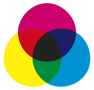
As shown in the graph above, the CMYK gamut is smaller than RGB, but also note that there are inks which cannot be accurately displayed on a computer monitor. In addition, there are specialty inks like silver metallic that would have no representation in an RGB scheme.
Grayscale
Although in theory one can find RGB values or CMY combinations which are more or less gray, as a color model grayscale contains no color information, only a representation of the degree of blackness.
On your computer screen, grayscale must of course be represented by mixing the RGB colors it uses. In print, however, this is not necessarily the case, although some particularly intense blacks can be created using all the C, M, Y, and K inks. A minor issue here is cost, but also that using more different inks is time consuming and requires painstaking alignment for each reprinting with a new color. Thus, if possible, one might wish to use one or two colors only.
Duotone
In these situations we then might consider duotone, monotone, or trichrome, where one intentionally processes the color information to make use of a restricted number of inks. In this case, one might use unique colors of very particular hues, known as spot colors, to achieve this end.
Composing your palette
Whether it might come from some already created palette or one you create yourself, choosing a palette is an essential step in the creation of your document. Its importance relates to its ability to set a mood for your project and also affects legibility.
Sorting colors
Scribus has a dialog dedicated to Colors, brought up with the menu selection Edit > Colors. You will have a default selection of colors, each of which has a name, but also has an indicator which shows the color model used:
- CMYK – this is a color defined in this color space. What you see on screen is likely an inaccurate representation of how this will look in print.
- RGB –this is of course the native color model for your monitor, and while you can expect Scribus to convert to CMYK if your intended output is for a printer, you may easily lose some of the vibrancy you see on screen. On the other hand, if you are making a PDF primarily for web use, no such limitation will occur.
- Grayscale – if you wish to work in grayscale, clicking Delete Unused Colors will reduce your palette to White and Black, and Registration.
- Duotone – here again, Delete Unused Colors may be helpful as a starting point, after which you can choose colors to be used in your limited palette.
Note that removing colors doesn't absolutely eliminate their use in your document. If you import an image or graphic with color, these will still be in the output. Therefore, you must pre-process your images to grayscale if that is what you wish the output to in fact be.
Create colors
Once you have reduced your list of colors to its essentials, you are ready to complete your palette.
To add a color, click the New button. To change an existing color, click Edit. The dialog which appears next gives you a number of parameters to choose or edit. If you are making a new color, you may want to immediately choose a name for your color, and its color space, CMYK or RGB.
At the top and right of the dialog you see your default HSV Color Map, which gives you the entire range of color within your color space. Other choices will give you the colors from the various palettes included with Scribus, and in addition any palette you may have created and saved. You can either use these colors as they are, or modify them according to your needs, in which case you should change the name to avoid confusion.
The sliders underneath your new or chosen color allow you to modify the hue and saturation as you wish.
Spot Color
Spot colors are a special ink, frequently proprietary, with a premixed formula, used to precisely define a color for repetitive use, and may allow for limiting the number of inks used in printing. A commercial business may choose one or more spot colors for its logo.
Because these are premixed, you cannot modify the hue or other parameters and still use this spot color ink, even though Scribus will certainly allow these edits. If you include such a color without changing its name, your printer will use the original spot color.
Where possible, Scribus has made an attempt to include a number of spot color palettes from various vendors, and some other palettes as described by various government agencies.
Choosing colors
This echoes the title of this chapter, but now we begin to discuss the choice of specific colors for your document. This is a daunting prospect for beginners, to which some may react by excessively reducing their color set, and others by using a large palette in some sort of unbridled way. So here we will try to explain a rational approach. Begin by considering how the colors you use affect the mood of your document and how your colors interact with each other.
There is fortunately within Scribus a tool which can help with choices, the Color Wheel, brought up by clicking Extras > Color Wheel.
There is a fairly detailed description of the Color Wheel in the English version of the online manual. Here we will try to go over some overall concepts. For whichever color scheme you choose, you begin with a base color. This is a color you will definitely wish to use, and will use the Color Wheel to help you choose what others to use with it.
Now we see the various schemes – Monochromatic, Analogous, Complementary, Split Complementary, Triadic, and Tetradic. Monochromatic is perhaps the simplest, with two variations on your base color having more brightness or darkness, but the same hue. The rest of the schemes allow for choosing palettes with colors which are related (analogous), or those which offer the greatest contrast (complementary).
Replacing colors
It is very much worth mentioning that, should you use some color in your document, then change your mind yet not actually want to edit the original, you have the option by using Edit > Replace Colors... to change a color wherever it is used to a different one. This will not eliminate the original from your palette.
Patterns
Admittedly, it is far from obvious, but you also have the capability of saving and using patterns for use as a background fill for various objects. Once you become familiar with them, you may create or import some patterns, just as you prepare your color palette.
Getting patterns
Just as clicking Edit > Colors will bring up a dialog for colors, you can click Edit > Patterns to bring up a dialog to manage patterns. The first time you do this, you will no doubt be disappointed to see that there are no default patterns. You can easily find a number of free patterns on the web, typically in a zipped file. After you unzip, look for bitmap files – you will not be able to use files ending with .pat in case you run across these. Make sure you understand the licensing terms of any patterns you might download, since for example, they may allow for free personal use, but not in any commercial project.
Load individual patterns with Load File, or load an entire directory of patterns with Load Set.
Making your own patterns
From most objects you can create a pattern by right-clicking for the context menu, then choosing Send to Patterns.
Using patterns
Use patterns as you would a fill color. In the Color tab of Properties, clicking the button just below the selector for fill opens a drop-down list, which includes Patterns, and will show what patterns you have available. Note that if you have no patterns, this choice will not appear.
Now choose your pattern, after which you may adjust the position, scale, rotation, and opacity of your pattern. A limitation with setting a low opacity (more transparent) at this point is that content of a text or image frame will also be affected. You can work around this by adjusting the opacity of your object before you Send to Patterns.
Color management
Sooner or later, anyone who works with layout and the graphical workflow will become concerned about the color rendering of a document once it is actually printed. You need to become familiar with the constraints which your document is under, depending on the format in which it will be published, and what sorts of problems may surface during printing. In order to minimize various problems, usage of color management is advised. This involves a series of steps, in an attempt to limit variability in anticipation of expected problems. At the core of color management are color profiles, commonly known as ICC profiles, which aim to act as a bridge between color spaces.
In Scribus, color management is accessible via File > Preferences > Color Management for global changes to act as your defaults, and through File > Document Settings > Color Management to be applied only to the currently open document.
Profile acquisition
The colors of the bitmap or vector image file are the initial source of color data. In photography, the camera is responsible for transmitting the information about the profile along with the image. If a scanned image is used, the scanner will supply this information. For a vector image, the software which created the vector image should include this information in the file. We can see the complexity created when we begin with a photograph from a camera (one profile), which is then printed (a second profile), then scanned (a third profile). Profile management is usually designed to preserve the profile of the original source document.
RGB is ubiquitous
One of the reasons for this is that it allows for a very large range of colors to be represented, thus permitting a finely tuned adjustment of color. In some cases, CMYK may be preferred, especially when this is known to be the final output of the publishing process.
It is also possible, for example when utilitizing a scanner, to create your own custom profiles, in order to have greater control over the final results. There is a methodology to this, and it requires special equipment and expertise to be done properly.
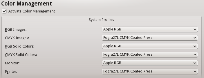
Profiles in Scribus
In Scribus, the profiles are managed in the Preferences Color Management tab as shown above. For RGB images, for example, there is a drop-down list of choices for standard certified profiles that will be applied to images which do not include a profile. Scribus supports CMYK profiles in the same way, allowing a choice of various ISO standard profiles, or a custom profile if you prefer.
The simplest way to add your own profiles is to place them where your operating system automatically stores them. For Windows, this is \Windows\System32\spool\drivers\color. Mac users can either use the share directory /Library/ColorSync/Profiles, or for those who do not have administrator rights, /Users/<username>/LIbrary/ColorSync/Profiles. On Linux distributions the directory is either /usr/share/color/icc, or for those without administrator rights /home/<username>/.color/icc. In these directories, ICC profiles will be automatically loaded when you launch Scribus.
The monitor profile
Ideally, for the best color control, working on screen should include color calibration of the display of your monitor. By definition, this is the RGB colorspace, and demonstrates why having the proper ICC profiles is so important.
Calibration is accomplished with the use of hardware to read the display and software to make adjustments. The method will generate a profile specific for the particular monitor in its particular environment – the brightness of the workspace is also a factor. This profile is then applied to the monitor. Scribus, for its part, allows selection of this profile in the Monitor setting in Preferences. By default, the profile of the manufacturer would be applied, if available.
How the profile is used
Monitor profiles are not intended to override the embedded ICC profile of an image, but rather to adjust the display in order to represent most accurately the actual colors of the objects in the image. Typically the standard white of a monitor will be too bright. The colors and brightness of the room around us will also affect us, depending on whether it might be a sunny or cloudy day. Thus, trying to keep the workspace environment a neutral gray color can be important for consistent work.
Color Profiles
Scribus has chosen to distinguish image profiles from color profiles. This makes it possible to utilize more ambitious bitmap RGB profiles while the user focuses on a different RGB profile better suited to the demands of layout and print (in text and shapes, for example).
Just as there are two drop down menus for choosing profiles for RGB and CMYK images, there are two for RGB and CMYK solid colors in the Color Management dialog in Preferences. The first would be used for output intended for the screen or web, and the latter for actual printing on paper.
Rendering
Profiles will hardly be useful unless you have a way to simulate the document as it will appear in the publication medium. This way you can preview the work to see the limitations of its profile and correct any problems.
Simulated conversion
Profiles contain color information. This is important since the origin of the image will determine how the image and solid colors will be converted to the appropriate color space.
Conversion between color spaces is not made directly, even when those color spaces are similar. Instead there is an intermediary step to the widest possible mode: L*a*b.. Therefore, an RGB profile will first be converted to L*a*b before subsequent conversion to another RGB or CMYK profile. In comparing two different profiles, there will be values in one profile which fall completely outside of the other profile. Thus, you must adjust the entire profile and not just the values which do not match.
Simulating the maximal ink coverage
A profile can also be used to limit the analog result from a digital conversion. For example, and intense black on screen is not a problem. However, when printed, a direct conversion to CMYK values might end up with superimposed ink layers made up of 75% cyan, 65% magenta, 85% yellow, and 90% black, resulting in excessive ink and smearing.
To prevent this smudging, profiles will limit the amount of ink coverage (TAC for total area coverage) that a sheet of paper can accommodate. For some situations, this may be 240% TAC. European standards are limited to 320% or 300%.
Rendering intents
There are several rendering modes suitable for media publication. As with profile management, Scribus distinguishes image profiles from solid color profiles. Thus, you may use the profile best suited to a rendering mode for the particular object.
Rendering modes allow for a screen preview of the color conversion which will later occur when you export your document. There are four modes.
- Perceptible attempts to convert between profiles to preserve the relationship of similar colors, avoiding the creation of tonal bands. It is recommended for print publications.
- Relative Colorimetric focuses mainly on matching colors compared to the original, calibrating the white point for the output paper. It could also be suited for print publication.
- Absolute Colorimetric also attempts to match colors compared to the original, except there is no white point compensation. Therefore, it will be best suited to spot colors, and not useful for images.
- Saturation, as the name implies, will absolutely respect the original colors, at the expense of transitions. Just as with Absolute Colorimetric, it should be used only for spot colors, logos, or symbols.
Simulate Printer on the Screen
You can also display an on-screen preview of what will actually be exported to the particular media, especially in regard to printing equipment. It is possible to customize the simulation by forcing color to match those in the color space of the printer output. Begin by checking Convert all colors to printer space.
Check Mark Colors out of Gamut in order to see the colors which might not print correctly, usually because they do not exist in the destination color space.
Use Black Point Compensation is an operation to balance the contrast of an image to compensate for the mixing of inks. In a photograph, for example, the mixture of black corresponding to the darkest value of the image will be enhanced by the CMYK profile, so that the mixture of inks is not excessive at the time of printing.
Appying color management
Color management begins of course with the acquisition or creation of compositional elements, but the time of software layout is the most critical to determine the color profiles which will ultimately be applied.
User Preferences and settings
By default, color management is determined in the settings in File > Preferences > Color Management. The settings here will be applied to all newly created Scribus documents.
Sometimes, however, you may wish to alter the settings for a particular document. In that case, you might use File > Document Settings > Color Management to change settings for a particular document you are working on.
You can also change settings from the main window, using the Enable/disable Color Management icon to the right in the bottom toolbar, next to the Enable/disable Preview Mode icon. If you click-hold the color management icon, you see a button to click to Configure CMS.
You can, of course, choose not to apply color management, but this may cause significant differences between what you see onscreen and in the printed output.
What profiles should you use?
Profiles are as numerous as the number of different pieces of equipment used to display or print documents. A commercial printer may sometimes create their own profiles for their workflow and infrastructure, or call on specialists to generate them.
Manufacturers will usually provide a profile with the device they produce. Generally, it is advised to use these manufacturer-provided profiles, but you must consider that with time, the accuracy of the profile may shift. Monitor screens in particular, may show changes in colors and brightness over the working day (from heating of components) and over months (from wear). Demanding people will therefore recalibrate profiles using measurement devices to reflect these changes. Some equipment comes with adaptive software to adjust settings to real-time hardware changes. Argyll free software and its derivative such as dispcalGUI can create profiles.
There are also standard profiles which serve as global references in the absence of specific ones. These are generally produced by consortia, official groups who determine, based on media and the available world inks, generic profiles from specifications issued by the ICC (International Color Consortium). For Europe, the ECI (European Color Initiative - eci.org) publishes RGB and CMYK color profiles adapted to the European workflow based on the specifications of Fogra standards and ISO related to color. Profiles available from the ECI are also available in a version limiting maximum ink coverage to 300%. These profiles make an attempt to standardize procedures, and may be a reliable basis for work in the absence of information from the printer.
The difficulty of multimedia publication
There is great difficulty with profiling a document to be posted on the Web. While it is relatively easy and recommended to preview a document made with color profiles corresponding to a particular printing material, you cannot anticipate the screen rendering of a document which will be displayed on a huge range of screens accessing a Web page.
Not only are there a wide range of kinds of hardware for visual display, but some may not have accurate profiles with which they operate. You must accept that a document created with Scribus will not necessarily display accurately wherever it is viewed. The best approach is therefore to rely on the profiles most commonly used for RGB output: sRGB and Adobe RGB.
Composing
Now that you've created your Master Page, and have your guides in place, it's time to begin the work of adding your text and graphic content.
Frames
As you discovered in the chapter Hands-on, your content will be placed in frames, which might be called boxes in other programs. The name frame comes from the device of that name used in the days of typesetting with lead type, which was a physical wooden frame to hold the type together.
Frames serve as containers for whatever you wish to have on your page, and for the most part one kind of frame can be converted to another, but note that a frame can only have one kind of content. If you convert a text frame to an image frame, the text disappears. If you right-click on a frame to bring up the context menu, from which you will see Convert to, with some choices.
One way of beginning your layout is to create a number of empty frames of various types, sized and positioned for a pleasing appearance. Use the Snap to feature to align them with your guides as needed. Remember, this is set with Page > Snap to Guides.
Colors, gradients, and patterns in frames
Giving a background color to a frame is a simple matter of going to the Properties palette (opened up with Windows > Properties, or pressing F2), then from the Color tab choosing a color from your color palette, making sure the Fill button is selected (the icon looks like a spilling bucket).
The frame itself is a vector object, but for text and image frames the default is for its background and border to have no color. The paintbrush icon denotes the border, also known as stroke.
Aside from using a solid color, you also have the option of creating a gradient for the fill color. Just below the fill and stroke buttons is a drop-down list, where Normal denotes a solid color, then below that you have a list of various gradients. If you choose one of these, the first thing you will see when a color bar appears below the gradient choice is that you still only have a solid color, since you must choose the colors for the gradient you wish to use.
Note that there are two triangle markers below the color bar, and that one of them is red. This is the selected point for the color which is highlighted in your color list. Choose a different color and you should now see a gradient. Click on the other triangle to select it to change its color. You can also slide these triangles nearer to each other.
In addition, you may add more triangles by bringing the mouse cursor up below the color bar and clicking (once) – you should see the cursor change to a + when you are able to make a new triangle. If you want to delete one of these, click-drag it vertically from the color bar. The minimum number of these triangles is two.
As was indicated in the chapter Choosing colors, you may either download or create patterns from various Scribus objects. If you have any patterns, then this will be an additional choice in the drop-down list where you find gradients, after which you can choose a pattern as a background for your frame.
Basic design considerations
Any time you are working, and as of yet have no actual content, you may find this a good time to manipulate a collection of frames for a pleasing result. For example, in a 4-column text layout, you might have an image somewhere spanning 3 columns.
While there certainly are no hard and fast rules to designing layout, and sometimes of course breaking rules can be an intentional aspect, here are some things to consider:
- Begin with 2 or 3 elements, whether these might be some initial color choices, or objects on the page, then gradually build from there, trying to avoid what we might call a "layout pizza", with way too much of everything on it.
- Prioritize the information on the page– sometimes literally squinting as you look at the page will show you what immediately stands out visually, and there should be some hierarchy of attracting your attention, but hopefully no more than 3 levels of hierarchy.
- Since in most Western languages we read from left to right, top to bottom, this is also how we scan a page, so consider this as you arrange various objects. At the same time, contradicting this can heighten the interest and energy in your layout.
- Typography is the central concern in a textual document, legibility and readability are paramount.
- Consider white space as more than the absence of content, but an active element in showcasing your text and images. If you wish to strongly separate two areas visually, use lines as separators, but keep in mind that lines can be a barrier to natural eye tracking.
- Use contrasts to heighten visual interest – light and darker colors, large and small sizes, Serif and Sans serif, full and empty, proximity versus distance, balance and imbalance, shades of gray versus colors. Having a larger white space around some text draws the eye to that text.
- Keep things simple, and focus on the readability of your document. Use things like patterns and gradients sparingly (if at all), since they may attract more visual attention than they deserve.
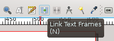
Linking text
Now that you have a basic collection of objects, arranged carefully, surely you will continue to refine your layout by adding what is needed and subtracting what is not. There is yet another important task you must know as you build the overall document: linking text, which determines how text connects from one part of a page to another or one page to another.
Scribus will not automatically create a new frame or new page once the current one is overflowing. So you must manually create those pages and frames, then use the linking tool. If you hover your mouse over the toolbar you will eventually get to the linking icon. From the main menu, there is also Item > Link Text Frames.
Once you see that you have overflowing text (indicated by a small box with an X in the lower right corner of the frame), you should ensure you have another frame to link to.
- Select the frame which is overflowing.
- Click the Link Text Frames icon.
- Click the frame to which to want text to flow.
- If you wish to link to a third (or more) frame, you must click the icon again, then the next frame in the linkage.
- If you need to unlink a frame, there is an Unlink Text Frames icon next to the one for linking. It will only be selectable when you have an already linked frame selected. Select the last frame which you wish to remain in the linkage, click the unlink icon, then then next frame, and linkage will be broken at that point.
Note that you can create linkages between frames even before there is text content. Also, if you have selected Automatic Text Frames when you created your document, whenever you add a new page, it will contain a frame which is already linked to the previous page.
In case you wish to view all of your text frame linkages, select View > Show Text Chain from the menu.
Sample text
There are times when you wish to capture in some rough way the visual impact of the combination of text and other elements, or perhaps help to choose an appropriate font with its settings. This is where sample text, sometimes called lorem ipsum, can be used.
Lorem ipsum refers to the most famous, perhaps original version of this, and goes something like this: Lorem ipsum dolor sit amet, consectetuer adipiscing elit. Ut a sapien. Aliquam aliquet purus molestie dolor. Integer quis eros..., which doesn't translate from Latin to anything since it's a jumbled up mixture of words. Nonetheless, it has a sentence-like structure, is divided into paragraphs, and contains a mixture of various words, both small and large.
To use sample text, select a frame, then from the menu, Insert > Sample Text (also obtainable from the context menu). From the dialog that appears you can choose the language you wish, and the number of paragraphs of text.
Typographic color
Typographic color, also perhaps referred to as typographical gray, is the perception one has of the degree of darkness or overall color impression of a block of text, which comes not only from the typeface and its weight, but also the white space between letters, words, and lines. This is also affected by the whiteness or the color of the paper on which the text is printed.
This is a very important consideration in your layout, since it is immediately seen by the reader before the actual text content is understood.
Factors which influence the tonal value are the specific font, its subset, weight, the linespacing (or leading), line breaks, kerning, and justification. It may be easier to appreciate the tonal value by squinting to make the text indistinct so that you are left with the overall gray sense of a block of text. You may also notice a non-homogeneity, if some areas are darker, some lighter.
Typography will be discussed further in its own chapter in the section Produce.
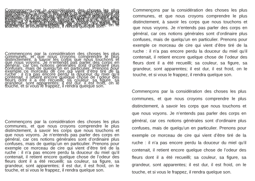
The image below shows the same text in 11 pt Liberation Sans with progressive linespacing of 3, 6, 9, 12, and 15 pts. Immediately you see the change from a very overall black appearance to light gray. This example shows only one of the parameters which can influence the tonal value, yet in a quite obvious way.
Stacking objects (levels and layers)
A final and important thing to discuss here is the arrangement of your various objects, not just in an X, Y space referring to there placement on the two-dimensional page, but also in a third Z axis, regarding which objects are on top or underneath other objects. This is especially important when two objects might be overlapping – one must be on top of the other.
In Scribus this is called the Level, and can be adjusted by right-clicking for the context menu, then under Level, choosing to raise or lower the object. Here you only know the relative movement you have selected, but in the X, Y, Z tab of Properties, where you can also make these changes, you will also see what level the object is on, 1 being the lowest. Note that each object has its own unique level.
Any time you add a new object, it will be placed above all other content, creating a new level.
For more complex documents you may wish to go further and create a new Layer, which will be another set of levels, separate from your original. Within a layer, you will have the typical arrangment of levels, one on another, but the entire layer will either be above or below some other layer.
Your default document will only have one layer, called Background. Bring up the layers dialog with Windows > Layers (keyboard shortcut: F6). At the bottom of the dialog, see the '+', to click to create a new layer, which you should give a meaningful name to. By default it will be created above the Background, but can be moved below it if you wish, by clicking the down arrow icon.
Some additional important features:
- You may only edit on one layer at a time, the one which is highlighted. This is a very useful feature, to keep from accidentally changing or moving objects. Furthermore, you can lock an entire layer, so that it cannot be edited even if selected.
- You can delete any layer except for the Background.
- You can rename any layer, including the Background layer.
- You can make a copy of a layer (with all its objects).
- You can choose to make an entire layer invisible, and independently not print (or export to PDF).
- You may choose to have all text on a layer flow around any objects on layers above it.
- Finally, you can represent all objects on a layer in a simple "wireframe" appearance for faster screen updates – this only affects display.
- You can easily move an object from one layer to another, by way of the context menu.
There is also a drop-down list for the blending mode, Normal being a separate representation of each object on a layer. Experimentation will show how these various setting affect the appearance.
In the upper right corner of the dialog you can set the Opacity or transparency of objects on that particular layer.
As you may imagine, using layers is a very powerful tool in creating and manipulating your layout.
Document format
When you create a document, its page dimensions are of paramount importance. This should be chosen according to the document's content – not just the amount, but its meaning, its structure and organization, and its target. From the menu, File > New brings up a dialog with various options, confusing for the beginner, yet still essential to the document's design. Not only does this need to anticipate the layout, but also the eventual output from the printing equipment.
Size
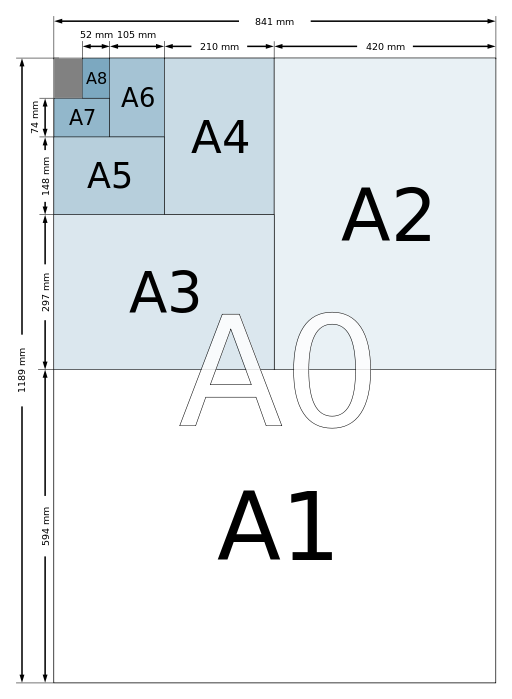
For convenience, as well as efficiency, it is common to use proven standards of size based on ISO specifications. Worldwide, the most common standard is based on the A formats, especially the widely used A4 commonly used in your computer's local printer – US Letter is similar in size.
Principles of Imposition
Depending on the specifics of the commercial printing equipment, the printer may do an imposition, with assembly and arrangement of the pages to be printed on a paper size much larger than the finished document's pages, since this paper will be folded in order to create the final size. This not only saves the amount of paper handling involved, it easily allows printing to the edges of the page.
Below we see a scheme of imposition depicting the distribution of a 16 page document on 2 sides of a sheet of paper. When properly folded and then cut, the pages will be in the correct order on 4 smaller sheets of paper.
Imposition is facilitated by having paper sizes where there is a constant ratio of width to height, regardless of size. Throughout the A format series of papers, there is a relationship of width:height of 1: . Thus, one can subdivide 1 sheet of A0 paper into 16 sheets of A4.
Here we can appreciate the flexibility of the A format series – the A1 width is half the height of A0, A2 width half the height of A1, and so on, and thus this 1: ratio is maintained throughout the series.
When you look at the Size choices for the New Document dialog, you see that Scribus has a very large number of choices for you.
Orientation
There are two choices for orientation:
- Portrait, the most common, since we are accustomed to using paper taller than it is wide.
- Landscape, utilized for special situations, when width of objects or lines needs to be large. Many brochures will have a landscape orientation.
Units
The units of measurement are important, and are used throughout Scribus, for position and sizing of various elements of content, plus guides and margins, as well as the dimensions of the document itself.
The default units are points, a worldwide standard for typographical and printing measurements, A typical font which is 12 points in height is one-sixth of an inch.
A more generally used unit is the metric system, specifically millimeters for DTP. Since Scribus will automatically convert from one unit system to another, you can use whichever suits your purpose. Whatever page unit you use, you will see that your fonts, and font relationships, such as linespacing, will always be measured in points. It is recommended that you use or become familiar with a smaller unit, such points or millimeters, since these allow for greater precision when positioning and sizing objects.
In the New Document dialog, under Options, note the Default Unit which is set. Even if you forget to change this setting, you can change your units at any time. For convenience, go to File > Preferences > Document to change your default setting.
Document Layout
In the upper left corner of the New Document dialog, there is a setting for the page display on the canvas.
- Single Page is commonly used in general, and for single sheet documents such as flyers or advertisements. This could also be used for a PDF available on the internet.
- Double Sided is another commonly used display, since it conveniently displays the right and left pages of a book or periodical with their relative relationships while reading. Remember that imposition of the pages for printing is a separate step.
- 3-fold and 4-fold displays would be analogous to the double sided where 3 or 4 pages will be seen side by side. Note that Scribus will save, export, and print these as individual pages.
As was shown in the chapter
Hands on, if you would be planning to make a folding brochure from an A4 or similar paper, start with
Single Page A4 oriented in landscape, then use guides to help position your content.
If you have some idea of the number of pages your document will have, you can create as many as you need under Options. If not, you can easily add or insert more pages later.
As desired you may also create Automatic Text Frames, which will fill the page to the margins as each page is created, either at this stage or as you add pages later. Such frames will be automatically linked from one page to the next, and furthermore, you may specify the number of columns and gap between them.
Margins and bleeds
The use of margins is a personal preference, and mainly serves as a guide for placing your objects in the layout, maintaining a certain white space at the edges. For a Double Sided display, you have the choice of some standard margins, such as Gutenberg, Fibonacci, Golden Mean, or Nine Parts, which will of course be appropriately adjusted for right or left pages. If you are printing on your own printer attached to your computer, be sure not to exceed the printing area of your printer, and clicking Printer Margins... sets the margins for that purpose.
Highlight your information
At first glance, creating margins seems simple, yet consider that you are highlighting your text by the balance of white space around it. There may indeed be some elements which go to the paper's edge, like some background image or a swatch of color, but these are not the items you wish the reader to focus on. The focus should be placed on the text and any informational images you may have.
Create margins
Although you may be tempted to have identical margins around the page, and certainly there is a way to link the margins so that they are all the same, you would likely only want this for something like a newsletter or magazine.
- Most books will probably have some scheme in which the top margin is narrower than the bottom, and the outer margin larger than the inner (near the binding).
- Make sure that you have a minimum of 5mm (14.2 points) of inner margin, to allow for page area lost to the binding.
- If you are using a Double Sided display, you will have a choice of some traditional proportioned margins under Preset Layouts – Gutenberg, Fibonacci, Golden Mean, and Nine Parts.
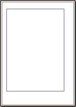
Bleed
Bleed is an area at the margins of your page which will be trimmed away after printing. Whenever you wish an image, a color, or graphic to print to absolute edge of the paper, this will guarantee that in your finished product, since you will make sure the object extends slightly into that bleed area. It's also worth noting that the bleed width is added to the page dimensions you specified under
Size, so that for example, an A4 with bleed will be trimmed to A4 size.
Here we see a right page of a double sided display, with Gutenberg margins. The area outside the red rectangle is the bleed area.
Editing a document's properties
As was said about "the best laid schemes o' Mice an' Men", it does happen that after we have begun work on a layout, we then need to change its format.
Fortunately, you are not stuck and need to start over. If you choose from the menu File > Document Setup > Document, you have the opportunity to make adjustments in the settings mentioned in this chapter. Alternatively, to change the current page, select from the menu Page > Page Properties to make whatever changes you wish.
If you do change any current pages with content, this may result in a need to adjust your layout and position of content.
Note that with Document Setup > Document, you have the choice of applying your changes to all pages, and there is a separate checkbox to apply new margin settings to all pages. You should learn quickly what sorts of changes and amount of changes are relatively simple and which require some substantial adjustments.
Editorial and graphical workflows
Thanks to the previous chapter, Begin at the end, you now should have an idea of some of the questions you should ask and answer as you start your project.
We don't wish to frustrate your creative energies, but understand that Scribus is not likely the only tool you will need to complete your design.
In this chapter, we will discuss the processes and practice of editing to help you understand not only the big picture of layout but many of its details.
Separate content from form
In the broad world of publishing, there are many different kinds of documents, long or short monographs or periodicals, with or without illustrations, and written by various types of professionals (writers or journalists) or even nonprofessionals. All of these factors affect your working method and how you will apply your layout and other software.
Regardless, a time-proven method in publishing is to separate the content producing processes from the layout producing processes. This would be useful, for example, if you might reprint a series of books using a different typeface or graphical style. Although it might be updated or corrected, the text largely remains the same. The author of the text is not thinking about its presentation and style, only its verbal content.
This might seem excessively rigid or a constraint, but in reality it is liberating, and allows various kinds of professionals to focus on their aspect of the project, making their own decisions as they see fit. The author need only make some indication of what is a title, what is a chapter heading or a paragraph, leaving the decisions about styles to the graphic designer for the most pleasing end result. Similarly, the designer is not concerned about syntax and semantics.
Scribus considers this distinction between content and layout, so you are well advised to keep these separate as you set up your workflow.
Editorial workflow
Imagine that you work for a large newspaper operation, which publishes its news in a daily printed paper, but also in a website. You are responsible for the overall layout of the newspaper. Your colleagues are journalists, photographers, editors, librarians, and even the pressmen and entry operators, since this is a long-standing organization that prints its own papers.
The newspaper has established a workflow which defines the path from text creation to delivery of the finished newspapers, with the following components – writing (by a number of authors), proofreading, editing, layout, proofing corrections, printing, finishing, packaging and delivery. The same text will enter a separate process, with its own layout and editing process for the website.
In order to work efficiently, these two processes must have their own set of rules, have different constraints on space available, as well as two separate technological processes for each finished product.
Graphical workflow
This is of course part of the overall editorial process, but is the distinct part of it that relates to the designer, who must have a sense of the overall design, while incorporating text and graphics with certain formats or styles, and making sure there is a cohesive and pleasing appearance to the elements as seen collectively.
We might divide this workflow into three steps:
- Creation – concept development, sketches, layout of the model (mockup), consideration of methods, and how they are applied.
- Pre-press – production phase, in which the actual project is assembled, problems identified and resolved before actual printing occurs.
- Printing – a sample printing is done in order to check the final result.
In your project you may or may not have a part in all of these steps, but pre-press is where Scribus comes into the process. Of course, if you are involved with something like a daily newspaper, you have a number of aspects of layout which remain the same for long periods of time, so the main daily job may begin at the pre-press stage.
Regardless of whether your project is your entire responsibility or whether you are working with a team, you will find that utilizing a workflow such as this will not only make the task easier but save much time, especially whenever you decide to make some alteration in the layout or style.
Planning your Scribus project
You will find that your work will include a number of steps which consume a variable amount of time. Plan to allow for several days for completing a project, especially if you are a beginner. Two important factors are the amount of text and the number of high-quality images you are incorporating. Even after you have made the basic layout, finishing touches can themselves take time.
Using an example of an eight-page booklet, where you create and proofread the text, then use pre-existing images, a professional might allow 3 to 4 working days for creation of the material, and 2 for the layout. As a beginner, always allow 2 days for the layout, even for a simple project.
Time allowances as percentages
| Step |
Time estimate
|
Create
|
|
1. Preparation and verification of sources
|
5%
|
|
2. Choosing the document format, creating colors, and choosing fonts
|
5%
|
3. Creation of master pages, guides, and scrapbook(s)
|
15% |
4. Preparation and creation of text styles
|
30% |
| Produce |
|
5. Import text and images, applying styles
|
15% |
6. Manual positioning, and typographical adjustments
|
10% |
7. Correction and verification of layout
|
15% |
8. PDF export and final adjustments for printing
|
These percentages are of course estimates, and will vary from project to project. If you are making some sort of periodical, steps 2, 3, and 4 will of course take no time at all for subsequent issues.
1. Preparation and verification of sources
This is the time it takes not only for collecting the text and images, but also logos, credits, databases, or any other sources of your content, and in addition, organizing these into directories, and making sure you have formats which meet the quality standards for your project.
This might include things such as research and selection of images, or checking a list of phone numbers. We are assuming you already have your content collected together, have proofread the text, and at this point are just verifying you have everything you need to begin the layout. While we acknowledge that in the real world this often isn't the case, this still remains a strong recommendation.
2. Choose the document format, creating colors and choosing fonts
When you start Scribus, the first thing you must do is to choose the document size, its orientation, and its folds. This is an important step, so if you want your readers to enjoy having it in their hands, put yourself in their place. Take a sheet of the appropriate size, fold as needed, and ask yourself whether this is the feel your are looking for.
A good working method would be to choose 2 or 3 fonts (one for titles, one for the body text, for example), and 2 or 3 reference colors that will be in your color palette. With these first elements you can begin to set the tone for the layout as a whole. If you're making a new issue of a pre-existing periodical, these choices have likely already been made.
3. Creation of Master Pages, guides, and scrapbook(s)
The next step is to create what we might call a page plan (also called flatplan), where you begin to decide where various objects will be on the page. If you are making a booklet then the number of pages is in multiples of 4 – otherwise you have blank pages somewhere. It's always good to talk to your printer about such issues.
Now that you have these basics planned, you can begin to create Master Pages, which for a book or booklet will have right and left versions, with appropriate placement of headers, page numbers, and so on. Also use guides or a grid to help create the virtual spaces for your content, and at this point you might also begin to create objects which will be repetitively used and save them to your scrapbook for future use wherever needed. There is no need here to create sketches of your layout as was done in the chapter Hands on.
4. Preparation and creation of text styles
Text and typography are the most important design aspects for any project containing written information – they are really the life of your document.
The bulk of your work here will involve creating and adapting paragraph and character styles. This is fundamentally how the quality of your document will be judged, and therefore worth whatever effort it takes to get it right. Once you create styles, with one click you can apply them to large bodies of text, then if you later modify your style, it will automatically be updated wherever it has been used. Creating styles is a good habit to develop, even if at the moment you're just working on a single line of text.
5. Import text and images, applying styles
At this point, you now import your content, then apply the styles you have made for your text. If necessary, adjust your styles.
Next, import your images, adjusting size and position in relationship to the text.
This can be a gratifying point, when you begin to see your layout take shape. You should now be able to appreciate the value of having made all of the previous preparations, so that you can focus on the layout, its overall appearance, and the relationships between various objects. Using Master Pages and styles magnifies the power you have to easily make document-wide changes.
6. Manual positioning, and typographical adjustments
For the most part, your job is nearing completion. But now you must begin looking at small details, such as the relationship between images and any explanatory text, any text that needs some sort of highlighting, managing hyphenation, fixing widow and orphan lines, using nonbreaking spaces to prevent certain linebreaks, avoiding "rivers" in your columns of text, in essence, everything to make your project not only a work of art, but also as easy to read and understand as possible.
Depending on the complexity of the layout, this step can have a very variable timeframe. Part of what you should be doing is learning how to make this step easier by modifying some design choices at the beginning.
7. Correction and verification of layout
Even though you might believe you are nearing perfection at this point, now is the time to read, reread, and again reread your document. Here you will appreciate good quality sources for your text – is it well written? Does it make sense everywhere?
It might seem implausible that at this point you might find simple typos at this stage, but it happens to everyone. It may help to make a quick print of the pages to facilitate finding errors, and allow you to mark corrections in the margins. Not only are you looking for typographical errors, but also errors in the meaning of what is written. Have others go over your content and layout as well.
8. PDF export and final adjustments for printing
Now that your errors have been corrected, your layout is beautiful and complete! Even though you thought about the eventual printing of your document as you began, now you must make a number of technical settings for the actual creation of the PDF which then goes to your printer for the final output – this is the final stage of the pre-press work which began with the collecting of your content materials.
Now you take your PDF to your printer, he tests it to make sure it will come out as designed, and finally your document will be in your hands!
Examples using Scribus
This chapter will show you some examples of works done with Scribus in various artistic and professional contexts.
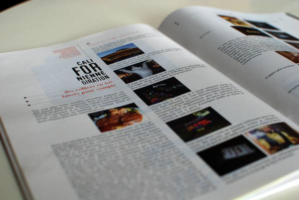
An independent general-interest magazine: Le Tigre
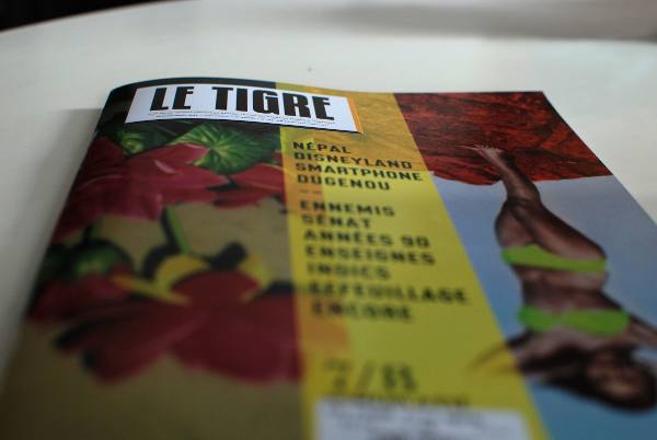
Le Tigre is an independent magazine free of advertising, founded in 2006, distributed on newsstands and in bookstores. Various journalists, photographers, designers, writers, and academics are involved in Le Tigre.
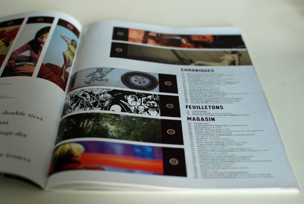
Le Tigre is distinguished by its eclecticism, where you might read long essays, geopolitical articles, cartoons, photograph portfolios, and criticism, among other topics.
It was the first newspaper in France designed solely with free software.
A New Zealand travel book
For two months in 2009, Marcus Holland-Moritz travelled in New Zealand. With the large number of photographs he took, he created this book, including a narrative about his experiences.
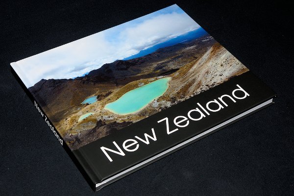
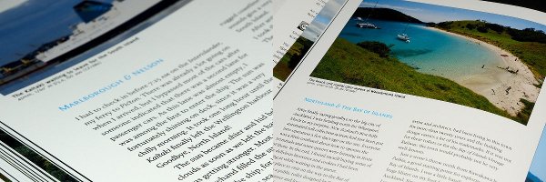
This book was published under Creative Commons BY-SA-ND license. For more information, visit the site: http://zrox.org/nzbook/ .
A DVD jacket for Villes en Eaux Troubles
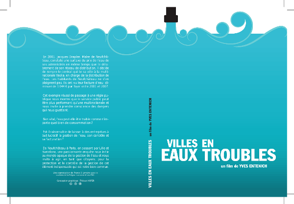
Villes en Eaux Troubles is a French documentary film by Yves Entenich. The cover of the jacket was designed using Inkscape, then imported into Scribus. Using microtypographic approaches, the spacing and kerning were carefully adjusted for a pleasing typographical color. Here we also see the cut marks at the corners.
Conception: Thibaut Hofer – Creative Commons BY-SA
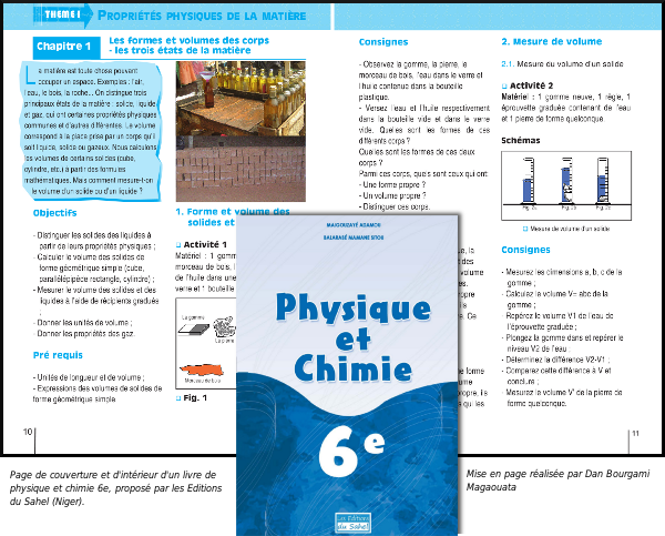
A textbook on Physics and Chemistry
A textbook for a 6th level Physics and Chemistry class, laid out by Dan Bourgami Magaouata, and published by Editions du Sahel in Niger.
A calculus book in African languages
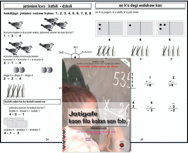
An introductory calculus book for bilingual schools in Dioula language used in Burkina Faso, formatted and published by Boureima Kinda OSEO Publisher / Solidar Switzerland. By using a single file with multiple layers, multiple versions have been possible in nine African languages, including Mossi, Dyula, Fulfulde, Lyélé, Gourmanchéma, Nuni, Dagara, Baraka, and Lebiri.
A brochure for the Wikipedia bookshelf
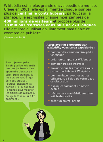
The Wikipedia Bookshelf collects and creates informative material about Wikipedia and projects, that serves to introduce new contributors to Wikipedia and other projects.
Wikimedia encourages the use of Scribus for creating this material and the most recent editions were indeed created this way.
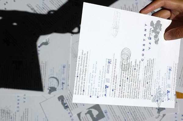
Experiments by Open Source Publishing (OSP)
OSP is a collective of designers using only free software. Closely linked to the founding of Media Arts Brussels Constant, they test the possibilities and realities of the practice of design, illustration, cartography and typography using a range of free tools, including Scribus.
A sales brochure for ActivDesign
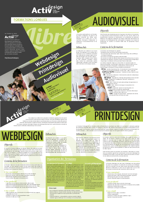
A brochure to describe training from ActivDesign association, the FormationLibre network of trainers.
4 pages in full color, printed on heavy coated paper. Design and layout by Cédric Gémy.
Introductory guide to beekeeping
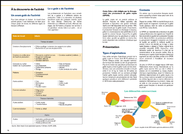
This introductory guide to beekeeping is published by the association ITSAP-Institu de l'abeille, which provide all necessary legal, economic, and practical information for those wishing to become beekeepers. Graphic and design by Cédric Gémy, 2011.
A CD cover for My.playlist
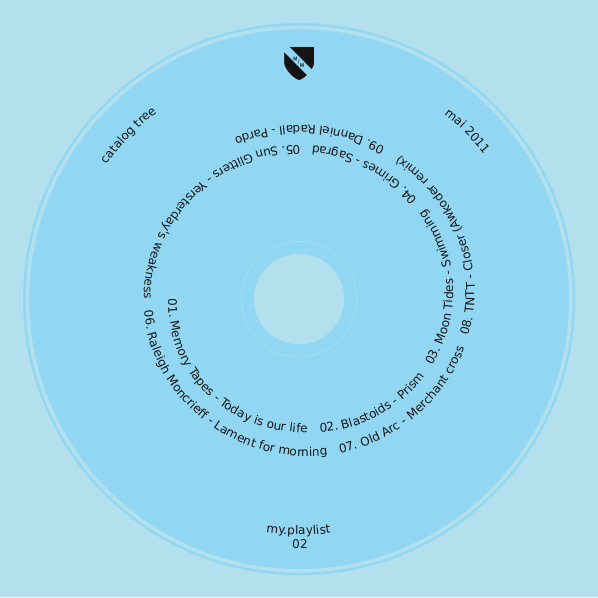
My.monkey comes from the My Monkey Art and Graphic Design Gallery in Nancy, France. On the disk is a combination of artwork and music. The cover is based on the template of an actual disk. The text was placed with Attach Text to Path on a spiral which was created in Inkscape, then imported to Scribus.
Design: my.monkey, Creative Commons BY-SA
The Sentinel Guide
Sentinel Guide is published by l'association des Eaux et Rivières de Bretagne, to raise awareness of their efforts in promoting respect for the aquatic environment and provide information on corrections in case of problems. Booklet, 52 pages, two-color printing, and a PDF form on the web. Design and graphic design by Cédric Gémy, 2011.
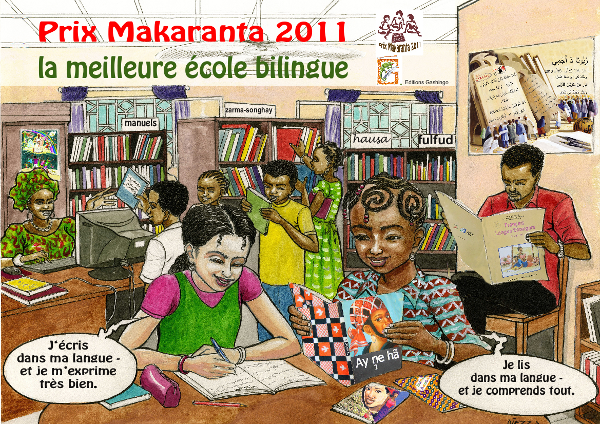
Poster for the 2011 Makaranta Prize
A poster produced by the foundation for the Makaranta Prize for bilingual schools, "Encouraging reading in French and the national language", Niger.
A brochure for the Forum des Alternatives
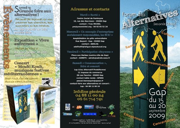
A leaflet in three parts, folded to letter size, containing descriptions, dates and locations proposed for this event in Gap, France in 2009. Scribus was used for the layout of the flyer, with assistance from Gimp for the cover illustration.
Under the direction of Camille Bissuel (yagraph), CC-BY-SA http://www.yagraph.org/yagraph/content/plaquette-pour-forum-alternatives
A book on building yurts
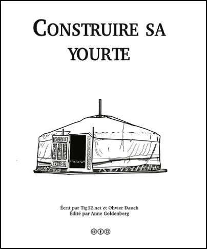
As of early 2012, this book of one hundred pages on building yurts was still in progress. The project was begun in 2008 by Anne Goldenberg, a motivated novice, who wanted to take information from a website (under a free licence) and publish a book on construction of a yurt. It has been a slow project, perhaps in part related to not having a book about Scribus.
She had hoped for publication in 2012, under CC-BY-SA.
Frequent problems
"It's not working!" is a common reaction, sometimes even a voiced complaint, when some result doesn't quite meet our expectations, or even contradicts what we were trying to do.
The first thing to do might be to read this section to try to understand the various details and issues involved in what you just did.
Then begin to think about the problem, considering that you may have set up some conflicts in the various settings you have made in the creation of your document, such as trying to move an image you had previously locked.
Where to approach the problem?
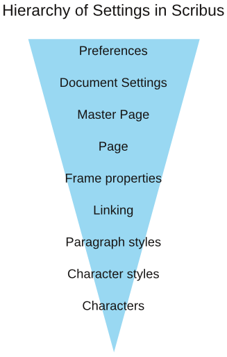
It is typically extremely frustrating whenever you cannot locate the source of a problem. In this situation, you should keep in mind the hierarchy of the various rules which apply to your Scribus document – what you see amounts to the sum of these various settings you have applied.
In this hierarchy of settings, those higher on the scale (such as Document Settings) will be initially applied globally, but may be contradicted by a setting at a lower level (such as Page Properties) to introduce exceptions. This might allow, for example, to include inside a book a larger page folded, to include a map.
Understanding this hierarchy in fact will help us solve problems, by localizing its source to some particular level, the first step in its solution.
Here is a simplified model of this hierarchy of settings, from highest to lowest:
Once you identify the appropriate level, the solution is at hand.
I'm stuck with a tool!
Once you use a tool such as that for creating a frame, Scribus will automatically revert to the Select Item tool. If you select the wrong tool or change your mind, you can either click the Select Item toolbar icon, or press the Esc key.
My text frames jump or move
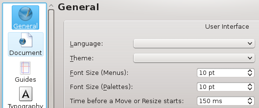
Sometimes with a mouse (or with a stylus for the happy owners of a graphics tablet), you may find that when you intended only to select a frame, it moves a very slight amount, due to your unintentional movement as you clicked. There is a setting in Preferences that markedly reduces this behavior. If you look in settings in the General tab, you will see Time before a Resize or Move starts, by default 150 ms, but increase it to 300 ms if you see the need.
Glossary
Various terms used in Scribus and in publishing.
Analog
The concept of an analog object is in distinction to a digital object. It might be the same sort of object (e.g., a thermometer), yet they show information in very different ways.
An analog object presents information often from some physical measurement (mercury level, an electrical signal, ...) which is continuous, and therefore has no predefined smallest unit, potentially of high resolution if precision of measurement is high. Anything measuring natural elements is analog.
The main drawback of analog data is that it is subject to noise and other errors of transmission, after which the quality of the information can be vastly reduced. Also, if one wishes to retransmit analog data, specific methods and signal attributes must be used.
Bezier Curve
In 1962, the French engineer Pierre Bézier invented this process that bears his name to describe automotive parts using computers. Since that time, Bezier curves have become known for being a very powerful and accurate means of describing curves geometrically, and therefore any vector graphics program will make use of them.
The basic principle is to define two points through which the curve passes, each point having zero, one, or two vectors. The vectors then influence the shape of the curve by their length and the direction in which they exert this influence. A longer vector exerts greater influence.
By increasing the number of points and vectors, any kind of complex curve can be represented. If a curve reaches its point of origin, it can become a closed path, in which the vectors at each end influence the adjacent curve.
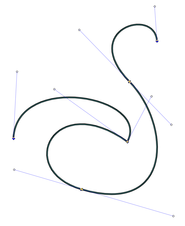
In vector graphical applications, Bezier curves have two main attributes: the description of the curve itself, and then the stroke, which determines color, width, and perhaps pattern or style of the line.
Bitmap or raster
This refers to the descriptive format for graphics and images, in which the picture is described by a series of lines of pixels (monitor) or dots (ink), each pixel or data point representing a particular color. Ultimately, representation of some image either on screen or on paper requires representation as a bitmap. A vector image must therefore be rasterized to be represented in these media. Higher data density (more PPI or pixels per inch, or DPI, dots per inch) will achieve greater precision and fidelity, at the expense of larger files and processing time for manipulation.
Scribus has some internal ability to manipulate bitmap images in various ways (see Image Effects in the Context menu), but also can rely on Gimp for more complex editing. Common bitmap formats are JPEG, PNG, GIF, and TIFF.
Bleed
The bleed is an extra space around the final document margins. Most printing equipment cannot print literally to the edge of the paper. In situations where it is desired that an image or graphical object literally goes completely to the edge of the space, the designer takes the border of this graphical content into the bleed area.
After the actual printing of the necessary inks, the paper passes through a trimmer, which cuts off this excess. Inside the bleed area there may also be other content, such as registration marks and the color palette of the document. Cut marks may be added as well, but your printer may prefer not to have these.
CMYK
This refers to a color space, and also a printing process, using the colors Cyan, Magenta, Yellow, and Black (the K is perhaps from the word Key). By printing layers of these ink colors on paper, one should be able to produce most colors (within the gamut of the color space). In practice, greens and bright orange may pose great difficulty, and even though CMY can produce deepening shades of gray, a true black is never quite achieved. Thus the inclusion of an actual black ink for this purpose.
Color wheel
Scribus offers a color scheme generator, which you bring up by selecting Extras > Color Wheel.
In design you must frequently come up with color choices which satisfy one (or both) of two possible intents:
- finding colors which do not clash with each other, i.e., are harmonious.
- finding colors which offer great contrast
Newton is credited with the first depiction of a color circle, but it was Goethe who offered some further and more pertinent work, particularly in regard to the pleasing and emotional effects of various color combinations. Since then, many others have offered their own refinements, sometimes for specific purposes.
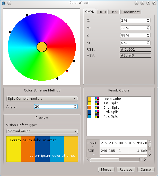
The color wheel offers a visual representation of color showing colors which are close together in hue (analogous), and others dissimilar (complementary). It arranges the primary colors around the circle, 120° from each other, and thus secondary colors midway between each pair of these. In practice, the color wheel allows us to choose among the following color schemes:
- Monochromatic – a single color is chosen for the base, with variants differing in lighter or darker versions.
- Analogous – here our base color is chosen, along with two nearby colors, each the same distance (angle) away on the wheel.
- Complementary – in addition to our base color, we are given its complement 180° away on the circle.
- Split complementary – from our base color, two analogous colors are created, then each of these analogous colors creates its complement, for a total of five colors.
- Triadic – from our base color, two additional colors are selected, each 120° away on the wheel.
- Tetradic (double complementary) – here we have a scheme of four colors, our base color, its complement, a single analogous color one direction or the other around the wheel, and finally its complement.
Also, do not overlook the inclusion of the Vision Defect Type selector at the bottom, where we have a chance to see if our color choices will be perceived in a sensible way by those with various color vision defects.
Digital
As noted in the entry on Analog, data or some measurement may be represented in an analog or digital way.
In theory at least, analog data is continuous, and therefore should not have any limits on its resolution – there may, of course, be limits on the resolution, precision, or accuracy of the measuring device. Digital information, in contrast, will have a finite limit of resolution based on the smallest unit one bit of data represents.
The adoption of the wide use of digital data and information relates to its ease in saving, altering, and transmitting of the binary information, which when combined with standards for some data format, allows for any machine anywhere to interpret the data.
One big disadvantage is that once the data resolution has been set, this remains the limit of the data detail. If we consider creating our data with ever higher resolution, we then face the practical limits of computing power and space to manage such massive amounts of data. We also know that digital systems are fallible at many points, with data loss or corruption as constant threats, yet hopefully as infrequent as possible.
For Computer Graphics, coming as it has out of the digital revolution, we use this digital information, manipulating it mathematically, accepting its advantages and disadvantages.
Editorial Channels
This isn't a commonly used term, but the concept is rather ubiquitous these days: the idea of having content which might be formatted and finalized for some particular purpose (or channel). In Scribus, one might simultaneously create a document for sharing on the web and also for print publication. The former would need to be of a lighter weight, and would require less precision and could have a lower resolution for graphics. Having scripts or specially purposed software for this would be a great time-saver.
Em and En
Em (also called quad or quadrilateral) is a unit of measurement which traditionally referred to the length and width of a block of type. Since in early typography the letter M entirely filled the block, this led to this name. Its size is then determined according to the size of the font being used. In Scribus, you will mainly encounter this in reference to the width of spaces or dashes (em space or em dash).
En is designated as one-half the size of em. Once again, you will encounter this in reference to spaces and dashes (en space or en dash).
Fixed width (monospaced or non-proportional)
Often simply called Mono (short for monospaced), is a combination of glyph and line spacing which each character, including the space from preceding and following characters, has the same width as all other characters. Thus each line of text will have a specific number of characters for its length. A positive result from this is that aligning characters in columns is easy. A negative result is the challenge of alignment of the lines for justification.
Font size
This is typically represented in points, but what does it refer to? Traditionally, in the time of printing presses using metal type, the size of a font referred to the height of the block of lead alloy for the glyphs, not the size of the glyphs themselves. This is perhaps why two different typefaces of the "same" size may have different heights
For example, here are groups of 3 letters, "Hyj", sequentially using DejaVu Sans, Droid Sans, Free Sans, and Nimbus Sans L, all at 36 points. The spacing between the horizontal guides is 36 points.
Frame (box) in Scribus
This is another traditional typesetting term which applied to the physical frame used to hold the type in printing for alignment and keeping it in place.
In Scribus it is the name of the containers used for text, images, and other graphics. Each type of container can only have one type of content – only text in a text frame, for example. When you convert from one frame type to another, its content will at least appear to be lost, and certainly would not be exported. However, if you might for example convert an image frame with image to a text frame, then later change your mind, you will see your image again when you convert back.
Graphical workflow
This term describes the entire process involved in the ultimate creation of some graphical work which results in the printing of multiple copies of some document. It includes creation, pre-press, and finally the mass printing.
Gutter
This is the name for the space between two columns of text, needed to visually separate the material, and also to give the page some "breathing room", so consider both of these needs as you decide on the width of the gutter.
Halftone and Duotone
Halftone is a printing technique in which, rather than printing an area with color homogeneously, an array of tiny dots of ink of variable size, shape, and spacing is printed. What this accomplishes is an ability to have subtle changes in color intensity, and is particularly suitable for printing photographs. The process can be extended to using more than one ink, giving the impression of an almost infinite array of colors on the printed page.
Duotone, as the name implies, is a process of using two colors, typically black over some other color, such as blue.
HSV or HSL
Stand for Hue, Saturation, and Value, and Hue, Saturation, and LIghtness respectively. They are not necessarily the same thing, although the lack of standardization means that you may find them used interchangeably.
Scribus uses the HSV designation. Changing the H component will change the hue or color in a circular fashion, while changing S adjusts the intensity of the color. For example, if we consider and RGB color of (0,0,100) and another (0,0,255), the latter will be more saturated and therefore more intensely blue.
The value or lightness is more complex, and in this case consider RGB (0,0,255) and (100,100,255), in which case the latter will be lighter, and in a sense more washed out. At maximum value all colors become white, at minimum, black.
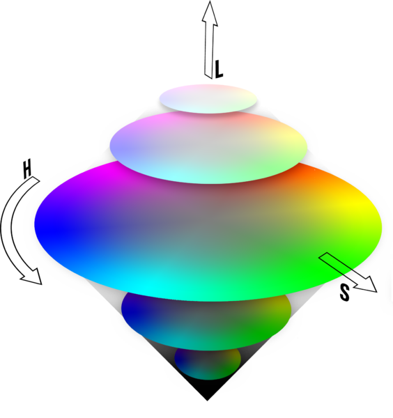
Imposition
When one conceives or reads a book or document, we think of the pages in order: 1, 2, 3, ..., to the end. If we have only 2 pages, we might simply print both sides of a sheet of paper and be finished. For any larger number of pages, and especially if we fold this into some pamphlet (as in the Hands On chapter), booklet, or book, we can see that the actual printing requires some work and calculation to reorder the pages so that when the pages are folded, when the book is assembled, the reader see them in the correct order. This reordering is called imposition.
In a simple 4-page pamplet, made by folding an A4 sheet of paper, we can see that one side of the paper must have page 4 on the left and page 1 on the right, and the other side has page 2 on the left and page 3 on the right.
If we consider a 16-page booklet we might denote the following sequence to indicate the pairs of printed sheets. Here we depict the printing of the front and back side of 4 sheets of paper to create a 16 page booklet after assembly and folding.
16-1
2-15
14-3
4-13
12-5
6-11
10-7
8-9
The actual order in which the sheets of paper are printed would of course depend on the specific printing equipment used. There are also more complicated processes used in the printing of books, in which many more than two pages are printed at the same time on a large sheet of paper, with the complex folding and cutting then occurring afterward. For a depiction of this see Document format: Principles of Imposition.
Layers and Levels
Imagine that you are in design school, attaching various objects to some work you are doing. Since each object is physical, it will either be on top of or underneath some other object in your workspace. In Scribus, this is the concept of Levels, and just as you can reorder this positioning in design, you can reorder it in Scribus. Just as in design, no two objects can be at the same place or level.
Now, imagine that you have a sheet of clear plastic on which you have placed many objects, creating a whole new set of levels. You then take this sheet of plastic and lay it down on top of your original workspace with its levels of objects, another layer of objects. This is the concept of Layers in Scribus, except that your sheet of plastic is virtual and invisible, yet just as with that sheet, you can put it on top of or underneath any of the other layers you are working with. In Scribus, note that you can only work on one layer at a time – this is a useful feature to keep you from accidentally making unintended changes elsewhere. You can also move any object from one layer to another.
Master Pages
Master Pages are pre-formatted pages which have limited content, perhaps a chapter heading or page numbering, used repeatedly in a document, typically a multipage document (you might also use a Master Page in a single page document when you produce different issues or versions). If used for page numbering, you will often need at least two versions, one for right-sided pages, and the other for left-sided.
Offset printing
A major advance in printing dating from the late 19th and early 20th centuries. Prior to that, printing was a very labor-intensive and slow process, either using metal type or lithography. In these two methods, ink is directly transferred from the original material to the paper. In offset printing, the original model in cylindrical shape transfers ink to a cylinder covered with a rubber sheet, which then transfers the ink to paper. The rubber allows for more intimate contact with the paper and therefore is of high quality. Furthermore, prints can be made in large quantities without degradation of the original, and therefore costs are much lower.
Only rotogravure or photogravure will produce higher quality images in quantity, but due to the cost of this process, one needs to make a very large number of copies for this to be economically advantageous.
Paper
If you visit a printing operation, you will see that paper comes in an amazing array of sizes, colors, and thicknesses. Outside of the realm of professional printing, we are mostly familiar with some standard sizes of paper, formerly used in typewriters, and now in the printer we attach to our own computers.
Internationally, the A series of paper sizes takes precedence. It was developed in 1922 by German engineer Walter Prostmann, with the design principle that the ratio of the length to the width is equal to the square root of two (approximately 1.414213). The importance of this is that when you fold or cut such a sheet in half, you create two sheets half the area, but having the same proportions as the original.
Thus, in the diagram below, we see that A4 is half the size of A3, A5 is half the size of A4. What this leads to in design is greater ease in resizing a document, since the pages' proportions are the same.
In the US and Canada, for historical reasons, US Letter and US Legal sizes remain the standards, and their relationships to the A series are also shown.
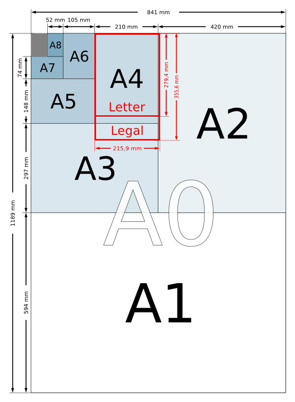
Proofs and proofing
The word proof comes from the German Prüfung, meaning test. Thus, the term refers to a test printing of the final product to judge various aspects of the creative and printing process, in particular the fidelity of colors as they were originally conceived. Some printers may request an actual signature on the proof before they will proceed with the production printing. In these situations the signed proof is something of a contract for the printing services.
Proportional spacing
In contrast to fixed width or monospacing, proportional spacing adjusts the width of glyphs and surrounding space in order produce a pleasing effect and improve readability. For example, the glyph for "i" does not require as much space as "m". In many cases proportionally spaced text will require less total space than the same monospaced text. A given proporional font may have variants: a regular, a condensed (narrower), and extended (wider).
Pull quote
This refers to some selected text which you copy from or pull out of the main body, then enhance it, perhaps by enlarging the font or making it bold. In Scribus, you would most likely create a new text frame, then strategically place it for the desired effect.
RGB
A colorspace made from the light colors Red, Green, and Blue, used for screen display, video, and stage lighting. In contrast to CMY(K), light colors are additive, and the maximum mixture of all three should be white. They are also similar to the particular wavelengths of light which the various cones in the retina can respond to.
While adjusting RGB values is simple and intuitively easy as a process, it can be cumbersome when one is searching for a particular result, and therefore many prefer using the HSV (hue-saturation-value) method for adjusting RGB colors.
Scrapbook (in Scribus)
Scribus can store sets of arbitrary objects of all types it supports in a library called Scrapbook, which can be saved in an external file. It is a practical addition to tools and templates, to be used for editable objects, recurring elements in the layout, or to prepare standard content.
Spacing
Space between characters in typography. Spacing is fixed in monospaced fonts, but especially in typography one is more often using proportional fonts, in which the width of characters varies in some relationship to em (the width of the letter "m"). There are two types of spacing: group spacing, which are the general rules for all characters in the font, and kerning, which applies to the spacing between character pairs. In some cases letters may combine to form ligatures, which are a single character/glyph (æ, œ, ff, fl for example).
Spot color
These are mostly proprietary inks having a particular color, and thus not requiring a mixture of CMYK for their appearance in a printed document. Some spot colors, such as gold or silver, cannot be represented in the CMYK colorspace, thus their utility.
To use a spot color you must be sure that the color exists and is available to your printer. If not, there may be an opportunity for a digital emulation of the color.
Scribus has a number of spot color palettes, as permitted by the patent holder of the ink.
Typographic color
Typographical color is the subjective impression produced as one sees the relative darkness of a block of space on the page consisting not only of the text itself, but any spaces between letters and lines.
Some examples are shown in the section Composing:Typographic Color.
The particular factors which contribute to typographical color will be the font used, its weight, adjustments to height and width of glyphs, spacing and kerning, line spacing, and justification. One may also get an impression of the homogeneity of this gray, perhaps disrupted by excessive gaps between words or letters at some locations.
Vector graphics or images
In addition to a bitmap representation of images (described above), there are also various vector formats, in which images can be described by geometrical formulas. Bezier curves would be considered a kind of vector format, and may be incorporated into some vector drawing.
In contrast to a bitmap image, a vector image has no inherent resolution, and therefore should show crisp detail even at higher magnifications. Therefore, the final detail is limited only by the display or printing device.
The main drawback of vector graphics will be seen where there are subtle and gradual changes in color or shading, often the case in photographic images, for example. This is why digital cameras typically use some bitmap format – in addition, of course, the photodetectors are arrayed in a raster format, so saving in vector would require a conversion.
Common vector formats useful in Scribus are SVG, PS or PostScript, EPS, and AI.
Hands-on
In this section we are going to take you through a short guided tour of Scribus. In seven steps you learn how to create a tri-fold brochure.
Make a draft sketch of your document
The first step takes place away from your computer – in a sense, since we are going to end up most often with a result on paper, we will begin by working with paper. To sketch your brochure, begin with a sheet of white office paper (A4 or US Letter), and fold it in thirds, so that it folds together as shown. Although in your actual brochure you might wish the inside flap to be slightly more narrow than the left front flap, so that it completely covers the inside flap when folded together, for this demonstration we are not going to bother with this precise detail.
Sketch some picture on the front flap, then check the result.
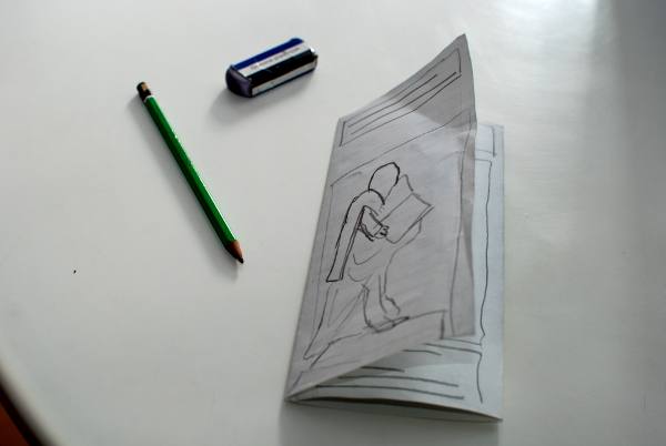
Some comments:
- At this early stage, feel free to make various drafts of your work, so that you can get the appearance of the brochure as you would like.
- Work with a pencil, paper, and eraser – this is a sketch, not a piece of art. At this point you're mainly interesting in working quickly.
- If you don't like what you've done at all, throw it away and start over.
Once you are satisfied with how the brochure works as a physical, folding object, you can begin to consider how you want to distribute the content on the various spaces on the flaps, front and back.
In general, you will probably want to use the three internal spaces for your primary content, so that the layout of these will be a sequential succession, left to right.
For the three other pages/flaps (those on the outside of the folded brochure), each has its own considerations regarding its content:
- The front flap (which when unfolded will be the right-most panel of the page) will contain a large image, a title, and very brief indication of the brochure's content.
- The middle panel will be the back of the folded brochure – we will use this for contact information.
- The left panel is the one which is first seen as the brochure is opened – it will contain further information on the content, perhaps some sort of listing of the contents.
In the images here below you can see how we have demarcated boxes or frames with some indication of how text and images are arranged in the brochure panels:
- You can see that we have simply drawn lines to indicate the text in the frames. You might alternatively write some notes which say something about the content of various frames.
- Image frames are noted by drawing a cross (so that we know this is an image frame and not text), or you might place a simple sketch to denote a particular content.
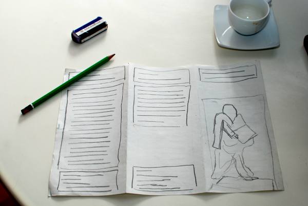
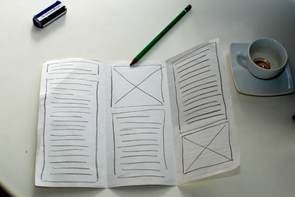
For this guided tour of Scribus we are proposing to create a brochure about Johannes Gutenberg, in relationship to his inventions regarding the printing press. We will be using images and text from the Wikipedia webpage on Gutenberg, which may be used under the Creative Commons licensing of their site.
Create a new document
When you start up Scribus, it presents you with a dialog for creating a new document. In case you may have closed this dialog, you can bring it up again with the menu File > New.

The document you are going to create will have the following characteristics:
- The type of display is Single Page.
- The size is A4.
- Orientation is Landscape.
- Make sure the units are millimeters, since the default may be points.
- Create 2 pages, for each side of our A4 paper.
- Choose margins of 1cm (10mm) to make sure we remain within the boundaries of where our printer can physically print on the paper.
Other parameters should remain at default settings.
Click on OK to finally create this document.
Here you see, in a scaled down view, how your document appears in the main window:

Now is the time to save your work. Create a directory Scribus_Gutenberg inside your Documents directory, then give your file a suitable name.
Define some guides
You will be using guides to assist with the alignment of the content according to the folds of your brochure. In the menu, select Page > Manage Guides.

Using the middle tab (Column/Row) you can create two vertical guides, with a space between them (Gap) of 2 cm. This value is double that of the margins, so that the content will be balanced in the various flaps.
Further, you want to define these guides with respect to the margins, not the page.
Finally, click Apply to All Pages and close the Guide Manager.

If you do not see the guides, go to the menu and select View > Show Guides.
Write some text
In Scribus, you don't write directly on the page – first you create frames which will then contain the text. In general, most graphical elements are contained in frames. With these we can freely move all of our various elements around the pages.
Go to the first page of your document. If necessary, use the slider at the bottom to position the cover flap in your workspace. You can also zoom your view by holding down Ctrl and running the mousewheel up and down while the mouse arrow is over the zoom indicator – quite easily done with this tool!
You can also move your page up and down, left and right, by holding down the middle button (or wheel), then dragging the mouse in the appropriate direction.
Activate the text frame tool by clicking Insert > Insert Text Frame from the menu, or from the icon (which is the one just to the right of the white arrow icon on the toolbar, then make your text frame on the page with a click-drag-release action.
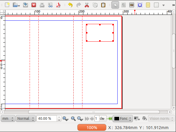
You can resize your frame by click-dragging the small red square at the lower right corner – resize it so that it can contain two lines of text: Johannes Gutenberg.
Notice that after you have created your frame, Scribus automatically switches to Item Selection mode – the icon with the white arrow is selected in the toolbar – which allows you to select and move objects. If you wish to switch from some other tool in the toolbar, either click the Item Selection icon or press Esc.
Double-click inside the frame, and the various adjustment squares disappear, so that now you can type in Gutenberg's name (you are now in Edit Contents mode).
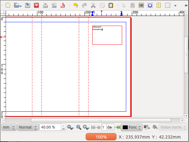
But your text is quite small isn't it? To change the size select all the text (if you are still in Edit Contents mode, from the menu select Edit > Select All), open the Properties palette (Window > Properties), select the Text tab, so that you can try various fonts and font characteristics, including the size of the characters (glyphs).
If the lines are too close together, adjust the linespacing. In general, a minimum spacing of 20% greater than font size is advisable.
You can exit Edit Contents mode by clicking on the canvas outside the frame or by pressing Esc, and of course you can go back to Edit Contents by double-clicking inside the frame.
Add an Image
The next step will be to place an image of Gutenberg's statue on the cover. Download this image from Wikimedia commons:
http://commons.wikimedia.org/wiki/File:Statue_de_Gutenberg_à_Strasbourg.jpg
Make a directory images inside your directory Scribus_Gutenberg and download the largest image (full resolution) into the images directory.
Activate the image frame tool from the menu (Insert > Insert Image Frame) or click the Insert Image Frame icon from the toolbar, and then with a click-drag motion create an image frame on the cover of our brochure.
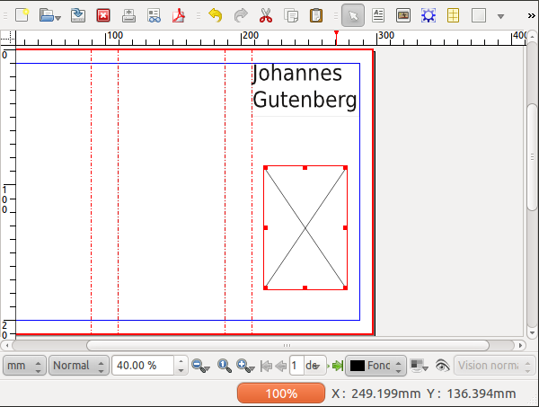
Make sure you have selected the image frame, then load the photo of the statue (which you should find in your directory Images inside your working directory for this project) by using File > Import > Get Image.
Most likely, your image appears all white – don't panic, this is the background of this image, and you're only seeing a small part of it! Bring up the Properties palette (Windows > Properties), select the Image tab, and select the options Scale To Frame Size and Proportional.
By default, Scribus will import images according to their resolution as noted in the file. Since there isn't yet any information about the resolution you would like to use, Scribus simply loads the image at its maximum size.
A quicker way to carry out this operation is to right-click on the image frame and select Adjust Image to Frame from the context menu.
Next, adjust the image frame by right-clicking, then choosing Adjust Frame to Image, then move the frame so that it lines up with the left edge of the leaf:
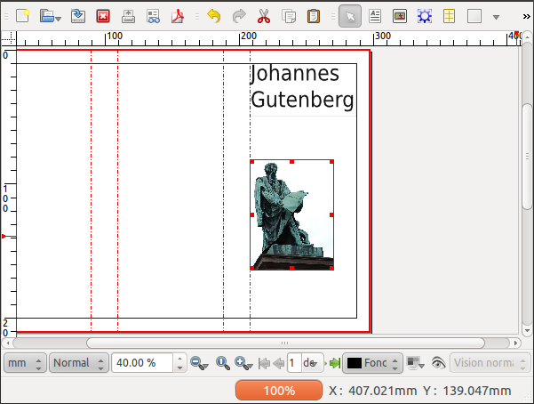
With a click-drag operation on the small red square in the right lower corner of the frame, you can now resize the frame so that it fills the column created by the guide to the left and margin to the right.
Import some text
As you will learn in this manual, Scribus is often not the best tool for composing text. In addition, much if not most of the time, you may be importing text written by others, or reusing text you have written for some other context.
To simulate this situation, we will use a browser to go to the Wikipedia page about Gutenberg – http://en.wikipedia.org/wiki/Johannes_Gutenberg – and copy the section Early Years, then open a text editor, create a new file, and paste the text from Wikipedia. Save the file in a new directory Text inside your working directory.
Create a text frame in the Inside flap, being sure the fill the space to the margins and to the guide. Select the frame, then from the menu, File > Import > Get Text to import the text you just saved in your file.
Use the instructions in the above section Write some text to adjust the size of the title in this text frame.
Linking text frames
On the second page of your document, you are going to add some text which links across the three panels.
Now let's apply a little trick – after you activate the text frame tool (Insert > Insert Text Frame), hold down Shift while you click inside the space for Content 1 – what you have done is to create a text frame which fills the space delimited by the margins and the guide. Repeat this for the other two panels on the second page. If you have trouble with this, you can simply create a text frame and enlarge to the desired space – in this case, setting Page > Snap to Guides can assist you in filling the space to its margins.
Now you have set up the layout, but you have no text. For our example we will use Sample Text – select the frame in the first panel, then Insert > Sample Text, and choose Standard Lorem Ispum.
If you look in the lower right hand corner of the text frame you see a small red box with a cross, which indicates that the actual text is overflowing the frame. Make sure the first frame is selected, then click Item > Link Text Frames, then click the second frame. Now select the second frame, click Item > Link Text Frames, then click the third frame.
Don't forget to save your work!
The important toolbar elements
Now that you've finished this little project, let's go over the main toolbar icons which you are likely to use in the composition of your documents.
- Selection tool
- Insert Text Frame
- Insert Image Frame
- Insert Render Frame
- Insert Table
- Insert Shape
- Insert Polygon
- Insert Line
- Insert Bezier Curve
- Insert Freehand Line
- Rotate Item
- Zoom
- Edit Contents Mode
- Story Editor
- Link Text Frames
- Unlink Text Frames
- Measurement
- Copy Properties
- Color Picker
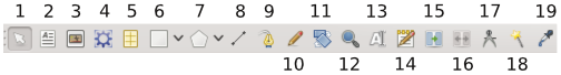
Congratulations!
You have created your first layout. Certainly not perfect, but a good start!
When you have actually finished a layout, you would be exporting to PDF for printing or distribution, but at this stage this is a bit complex. As you continue through the manual, you will learn this and other various tasks to use Scribus to its full capabilities.
Importing text and images
As we have said before, Scribus is page layout software, not a word processor or image manipulating software. While it's possible to edit text, draw vector drawings, or do photo processing, your possibilities will be limited compared with software dedicated to these tasks. Optimally, you will want completed text and fully processed images imported into Scribus for the most sensible workflow. By this method, you will still also have the original source files for preservation purposes.
Import text
Much of the time, text will be written by those who have little or know expertise with layout, and perhaps no knowledge of what the specific layout will be. Those who write for periodicals such as magazines or newspapers will have no idea of how their work will be presented in the layout, and probably no desire to know. Their focus is on the content, its accuracy, the prose, and whether a complete piece of work has been created. The editorial team will then make decisions about the relevance of the material and whether their instructions to the author have been carried out, even before the layout process begins.
The designer's role will then be to take this text, partially organized or not, and transform it as part of the layout process.
Scribus has the capability of working stylized text from a word processor (such as MS Word, OpenOffice.org, LibreOffice, KWord, Abiword, and so on), where the author will have the opportunity to simulate to some extent the final appearance of the text. This will facilitate communication between the author and designer where styles may affect the semantic content to some extent, but does complicate the process of incorporating the text into Scribus.
An alternative is to use a plain text editor (such as MS Notepad, GEdit, Kate, vi, and so on) which allows the author to literally focus on the verbal content, and allows the graphic designer complete freedom of decision-making regarding text styles.
How should you proceed?
You must have created a text frame before you can import text into Scribus.
- Create at least one frame. If you have created multiple frames these can be linked before or after importing your text.
- Select the initial frame, then
- File > Import > Get text.
- Scribus now brings up a file dialog, allowing you to navigate to the proper folder to find your text file. You may restrict your search to particular file types if this is useful. You may also search All Files.
Note that when you click OK, your text is imported and at that point you have lost any chance of selecting options at import. If you have made a mistake, repeat the process to replace the text, with correct settings this time.
You may have noticed there is also a choice File > Import > Append text, which works a bit differently.
- Get text will import and replace any text already present in the frame, though you will see a confirmation dialog if text is already present. If you existing text links through several frames, all of that text is replaced.
- Append text will import the text, but append it at the end of the text already contained in the frame or frames.
In case there is insufficient space in the frame for all the text, Scribus will not create any new frames or pages automatically. It will show a small square containing an X in the lower right hand corner of the frame (indicating text overflow), but it is up to the user to take care of the problem. Commonly, you will wish to pass the extra text into another frame, either on the same page or another one.
- Create a new text frame.
- Select the frame where text overflows.
- Click the Link Text Frames icon on the toolbar (keyboard shortcut is N), then click the frame to link to.
- To link to a third or later frame, you must click the icon again, then the next frame in the linkage.
- To break the linkage, then select the Unlink Text Frames icon (just to the right of the Link Frames icon), then select the frame where you wish the linkage to be broken.
- It is possible that this unlinking in the middle may produce undesired results. The quickest way to recover would be to Undo the unlinking.
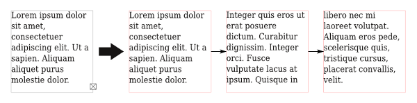
Automatic Text Frames
An exception to the need to manually link frames occurs when you choose Automatic Text Frames when you create your document. In that case, when you create a new page, it will automatically contain a text frame, and this will be linked to the previous page's text frame.
Plain text
When you save plain text from most editors and word processors, you will see that the default extension for the file will be .txt, if this exists as an option. Nonetheless, a plain text file can be saved with any extension of the editor's choice, and in some cases might facilitate recognition and handling of particular files.
An important characteristic of text files is the character encoding. When computers first came about, there were only certain characters available, but with time there has been an expansion to not only include various characters for non-English, non-Latin languages, and thus a great expansion in the need for new characters outside of the original ASCII and Latin characters. Here are some selected examples.
- System – this denotes the character set your computer is using for various tasks, including default saving of text in files.
- UTF8 and UTF16 – these are the most comprehensive character sets available, and will be able to handle almost all written languages, plus many other special characters. It is recommended to use one of these whenever possible.
- ISO-8859-1 – This can be adequate, and is a commonly used encoding on many systems, particularly when you are working only with Latin languages.
- Apple Roman – This is a standard specific to some kinds of software running the Mac OS.
HTML format
HTML has become ubiquitous, of course, due to its use on web pages. The format and its changes are managed by the World Wide Web Consortium (W3C), and we now see than many word processors can import and export this format. The difference from plain text is the ability to specify features of the styles and layout of the text, which can be useful when editors are interacting with page designers.
There are actually several versions of HTML, and Scribus is able to manage to some degree all of them. What Scribus can handle are tags such as <p> (paragraph), <b> (bold), <i> (italics), and various header styles. It will not be able to handle tags which specify particular fonts, or CSS in general. Tags which Scribus cannot handle are ignored. You should adhere to specific HTML standards to get the best results with importing into Scribus.
Scribus works with HTML as follows:
- It will import all textual material on a page. This would include not only the main body of text, but any menus and sidebars on the page. Therefore, you may want to consider editing the HTML before import so that it only contains the text you're interested in.
- For each header style, Scribus creates a style internally, prefixed with html_ (for example, html_h1). This is mostly a place holder so as not to replace any existing styles, so therefore you will likely need to edit this style to get the look you desire.
Here you can see something of the work entailed in editing HTML after import to Scribus. Although it may look like you have created links in your Scribus document, all that has happened is that a character style has been created which is blue and underlined.
ODT
OpenDocument Text format was developed as an open and freely usable way to save text along with all of its formatting features, and used by OpenOffice.org, LibreOffice, KOffice, and other word processors. It is a recognized ISO standard, unlike various proprietary formats, such as DOC. You will have the greatest flexibility and results importing this format to Scribus.
When you import an ODT file into Scribus, you will have some options:
- Overwrite Paragraph Styles – in case there is a name conflict with an ODT file and one in Scribus, this will overwrite Scribus's style with that from the imported text. Observe caution in choosing this option if you have already begun to make styles in Scribus.
- Merge Paragraph Styles – if more than one style in the ODT document have the same properties, Scribus will merge these into a single style. Occasionally, it might turn out there is some semantic reason for having two otherwise identical styles with different names, so consider that possibility.
- Use document name as a prefix for paragraph styles – this should be of some help to avoid accidentally overwriting a Scribus style from the ODT file.
- Do not ask again – if you check this, you'll have to remember how to get the default back again, since you won't see this requester until you do. In your .scribus directory, you will find a file named prefs140.xml, and inside that under the plugins, there is a context name OdtIm. You will see that the variable (key) is called AskAgain, and that when this value is 1, you will be asked again.
When the document is imported, paragraph styles are created, added to your list of styles, then applied to the text. For character styles, none are created in Scribus, but the formatting changes corresponding to the style should be applied where needed.
Because of various issues with the implementation of ODT import as it currently exists, it is difficult to make any categorical recommendations, but here are some particular bits of advice which some would make:
- It is not necessary for the author of the text to bother with making styles, and to some extent perhaps counterproductive. You will merely add the additional work of making sure styles have been properly imported and other changes applied where needed. Perhaps better to apply styles in Scribus, as long as you have a draft print of the ODT document to properly create and apply styles where they are needed.
- Some prefer plain text, and then will apply styles as they see fit within Scribus.
DOC format
Doc files are proprietary, which means that you cannot without permission from Microsoft make an application which make use of the internal structure of these files. Scribus cannot itself import files saved in the native Word format. For this task, Scribus uses a small utility called antiword which will allow importation of DOC files. The Windows version of Scribus has antiword automatically installed; for other versions you will need to get this utility yourself.
When you import such a file, all styles and formatting will be lost. In addition, you must check the text carefully after import, since in some cases blank lines or extra digits may appear at various locations.
An alternative and more reliable method would be to import your DOC file into OpenOffice or LibreOffice, then export as something more suitable for Scribus, such as ODT, HTML, or plain text.
Note that DOCX files are not supported, yet this should also be able to be imported by LibreOffice.
Importing images
Importing images is very common in layout. To be sure, some types of publishing, such as novels and to a lesser extent scientific publishing, may have little or no use for images. In most common situations, including photos or bitmapped or vector graphics is essential.
Photos
Scribus can import a number of different photo image formats, even though some of these may not be suitable for high quality layout and printing. The list of useful formats we have already mentioned the list of useful formats in Preparing your sources, but here we will discuss specific features of each to help you choose those appropriate for your work.
Importing is done, just as with text, with the use of a frame, in this case an Image frame, obtained by selecting Insert > Insert Image Frame from the menu, or by converting some other kind of frame, with Item > Convert to > Image Frame. Copying and pasting pictures will absolutely not work – instead, File > Import > Get image, or from the context menu, Get image.
In the Image tab of Properties you can adjust the dimensions of the image in the frame in two ways – either by selecting Scale to Frame Size (and perhaps choosing Proportional so as not to distort the image), or selecting Free Scaling, to manually manage the size and position of the image in the frame.
JPEG
This will be a commonly used format in layout, with a file extension of .jpg or .jpeg. Digital cameras typically save in this format as their default, even though others may be available. The reason this became the case was that the compression of the images allows for efficient use of memory in the camera. Similarly, this is a useful feature for images on websites.
The downside of this image compression is a loss of detail in the image, and furthermore, this is a so-called lossy format, since data is lost forever in the process of saving to JPEG. Generally speaking, the higher the compression (smaller the file), the greater the loss of detail, and the lower the quality of the image. This may not be noticeable on your monitor, but might be when the image is printed.
Importing JPEG to Scribus should occur without any issues. Note that converting a JPEG to some other format will not improve its quality.
PNG
PNG, on the other hand, is a better alternative as a compressed format, since it is a lossless format, so that image data is not lost, even though the size of the files will be somewhat larger than JPEG. An additional feature is that PNG images can have an alpha channel, allowing for partial transparency and some other image effects. Gimp in particular can create transparencies, fading, and many other effects.
All photo editing software can handle PNG images for both opening and saving.
TIFF
TIFF is one of the oldest image file formats, and is used extensively for high quality printed images. Not all TIFF images are high quality – for example, fax machines make TIFF images for their purposes. The high quality comes at the price of sometimes making very large files, perhaps the main drawback of this format.
Because of its long history of use, there is an interesting feature not possible with PNG, clipping paths. These are vector paths used to delimit parts of an image for some special effects and can be done with Gimp and other editing software. The use of clipping will be discussed in the chapter on Text flow and typography.
PSD
PSD is the native file format of Photoshop. This format is proprietary, and owned by Adobe, who have kept some specifications of the format secret since version 7. Scribus can import PSD files, but will fail with newer features introduced after this version. That having been said, Scribus can handle such features as layers and their visibility, transparency, as well as blending modes. This can be useful to alter the intensity of a shadow or even hide certain elements in the image.
Once the image is imported, layers can be accessed by the Extended Image Properties dialog, which you should see available through the context menu or Properties > Image.
SVG, EPS, and AI formats
Programs such as Inkscape and Adobe Illustrator work natively with vector drawings. Vector drawings, in contrast to bitmap drawings which describe an array of colored pixels, consist of mathematical descriptions of lines, whether straight or curved, which therefore will retain sharp contours even under high magnification.
In order to import a vector drawing, you do not have to use a frame.
- Click on a part of the page so that no item is selected – the reason for doing this is that some formats, such as EPS, can be imported into an image frame, but in that case, they will be converted to bitmap.
- From the menu, select File > Import > Get Vector File.
- You will only have the features which your Scribus installation can support. Select a vector file from the choices you have available.
- The mouse cursor transforms to something resembling a page or scroll, with a plus sign (+). Click the place on the page where you wish to place the upper left corner of the vector drawing.
- Often, you will see that the size is too large or too small, and perhaps placement not what you really wanted, but you can easily resize your drawing and adjust its precise placement.
Most likely, your vector drawing actually consists of a Group of individual components, which if desired can be ungrouped (Item > Ungroup once or more times) so that each element can be adjusted or edited as desired.
Any colors in the vector drawing will automatically be imported to your color palette, but of course can be changed according to your needs.
SVG
SVG was originally proposed by Adobe, and is now officially enabled by W3C. Many kinds of software and even some browsers can natively handle SVG files, and the specification continues to expand from the efforts of Illustrator and Inkscape. Although it has been criticized for not including CMYK, Scribus can manage both conversions from and to CMYK, and also process and spot colors, so you should have no concerns about color fidelity.
If some text is included in your SVG, it is good to vectorize your fonts for best results. Alternatively, and perhaps even preferably, leave all text out of (or delete from) the SVG and make your text within Scribus.
EPS
EPS, or Encapsulated PostScript, came some time after PostScript but before PDF format was introduced. The specifications have not changed since 2001, and consequently it is less used than in the past, but there is no reason to avoid or discard such files since Scribus can handle them faithfully. You may find many logos in this format. If possible, you may wish to convert EPS to SVG or AI mainly in the interests of securing the ability to import it to other software.
AI
AI is the native format for Adobe Illustrator. Because of that, it is widely in use, but since it is proprietary, there can be some issues with certain features which may not be supported outside of Illustrator. Scribus has only partial support, but it's usually worth a try to import into Scribus first rather than convert to SVG.
Tables!
As currently implemented in Scribus, tables can be considered a special instance of text frames. They are somewhat literally a matrix of text frames. There is now some ability to import Excel or CSV files, but this is limited. There also is some ability to deal with cell and overall borders, but frankly in a less than optimal way. Because these are individual frames, however, it is possible to convert individual cells to, for example, image frames, which could have some use in your layout.
Because of the various limitations, you may want to consider bypassing tables altogether, and make tables with the following process:
- Create your table in Calc (OpenOffice or LibreOffice). If you have Excel data in a file, open in one of these other programs.
- Select the portion of the table you wish to use, and make a copy.
- Go to File > New > Drawing.
- In the file window, select Edit > Paste Special, then choose the option which begins with Calc in the dialog.
- Now select File > Export.
- From the format choices, select EPS.
- Once you save the file, then import this EPS to Scribus.
The reason for doing this is that you will find that there is much greater ease in making various adjustments and settings in Calc than in the Tables environment in Scribus.
Installation
Why wait to talk about installation until the end of the book? Installation is certain a requirement prior to your first steps in learning the software, but it's not part of the usage of the software itself. Since this book has as its main purpose showing some best practices when using Scribus, the authors consciously chose to place the installation here in the appendix.
www.scribus.net is the site where you will find links to all the packages as well as information on some installation procedures.
Versioning
Before installing Scribus, it's useful to understand its versioning system. Free software typically has a numerical system which it uses in the software development process.
At the time of the writing of this book, the current official stable release is version 1.4. Somewhere ahead of this is a developmental version, version 1.5, which is not recommended for routine professional use, although it is available, and can coexist with 1.4 on your system. Once 1.5 has reached the point of being considered stable, it will be called 1.6, and that will become the official stable release.
So for now, use 1.4, which is stable, and available for various operating systems.
Linux
Scribus is available for all distributions of Linux. Some have installation packages, and for the rest, source code and all necessary other requirements are available to compile.
Packages
Scribus is available as an RPM for all the distributions associated with Red Hat, and also for SUSE and Mandriva. It often happens that Scribus is automatically included in the installation or upgrade of some distributions, and for example in Mandriva it can be found in the menu under Applications > Office.
Package managers
Many of the distributions have a GUI package manager that avoids any need to type commands to manually install Scribus: drakrpm for Mandriva, YaST for SUSE, Synaptic for Ubuntu, and so on.
It may be necessary to configure the manager to install packages from third party repositories, as evidenced by the installation process for Debian and Ubuntu packages shown on scribus.net: http://wiki.scribus.net/canvas/Debian .
Source
As with all open source software, Scribus has available its source code. Inexperienced and unadventuresome users may find this excessively challenging, so the authors of this book recommend consulting the official for instruction on the requirements and method of compiling and installing.
One advantage of installation from source is that you have available to you the latest updates, which include bug fixes and enhancements.
Windows
With Windows installation is more basic, and quite similar to installing other software by downloading an installer directly from the Scribus site from the Download page at scribus.net. Note that there are both 32-bit and 64-bit versions now available.
Official site of Scribus.
Mac OS X
As with Windows, Mac OS X uses an installer. You will also find DMG files on the Download page at scribus.net, although only version 1.4 is available at this time. Prior versions of Scribus recommended installation of X11, but this is no longer the case.
Master Pages, Guides, and Scrapbook
This chapter presents some features of Scribus which will help you create a logical and coherent structure of your document, and in the process demonstrate ways to keep your document organized by its structural components.
Here we will show three features:
- Master Pages are applied as a background for your pages, and contain objects which will be seen repetitively on various pages.
- Guides are horizontal and vertical lines with some magnetic properties, to help align various elements in your layout structure.
- The scrapbook is a place to store individual objects so they can be reused on various pages at various locations.
Master Pages
As indicated above, Master Pages contain objects which are seen again and again as a background of sorts for the rest of your content. Typical objects on a Master Page might be titles with associated graphics, and a page number.
The Outline
You can bring up a dialog showing an outline of your document(s) with Windows > Outline. This bring up a tree display of your currently open documents, and underneath, the list of Master Pages, and each document page. You can use this to navigate to each to these items for editing. Clicking on a Master Page brings up the Edit Master Pages dialog, in addition to displaying the Master Page for editing.
Arrange Pages
By clicking Windows > Arrange Pages you bring up another dialog, which also lists your Master Pages and document pages, but in addition can be used for navigation as well, but also assigning or reassigning Master Pages to various document pages. Double-clicking on a Master Page will bring up the Edit Master Pages dialog.
Creating Master Pages
In addition to the above two methods for editing Master Pages, you can choose Edit > Master Pages from the main menu. Note that whenever the Edit Master Pages dialog is open, you see on the canvas and are editing Master Pages, not the document page. Close the Edit Master Pages dialog to revert to displaying and editing document pages.
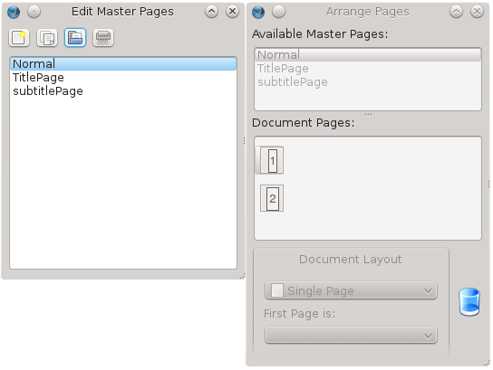
It is possible to make a Master Page from a regular document page, by selecting from the menu Page > Convert to Master Page. Next, select a name for this new Master Page, and also note that you can select to copy the items from whatever Master Page may have been applied to the document page.
You can assign Master Pages in three ways:
- by assigning the Master Page when a new page is inserted. (Page > Insert).
- by applying a Master Page to an individual page.
- by applying a Master Page to a series of pages.
With the current stable versions of Scribus, Master Pages are always operating as a background to any other content on the page, thus it will always show underneath the lowest layer of your document page.
Reusing Master Pages
You can also can import Master Pages from another document. Click the third button from the left in the Edit Master Pages dialog, after which you select the document and the particular items you wish to import. Be sure that you have access to any needed images or fonts.
Guides
Guides are a fundamental element of your document layout, and might most appropriately be used in your Master Pages considering their placement as a background for the document. These horizontal and vertical lines, which are not seen after export to PDF, help define spaces for visual balance, and assist in the alignment and organization of the content of your document pages.
Grid or columns
There are two commonly used patterns of guide usage:
- A modular grid, consisting of rectangular areas of similar or the same size, so that one might use one or more of these spaces to place text and graphics.
- Layout columns, where the same number of columns is used throughout the document. Note that images or illustrations may span two or more columns.
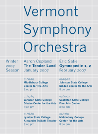
Above: a grid type of layout.
Above: page layout in 2 columns.
The grid is typically more demanding, since it often requires page-by-page decisions about sizing and placing of various elements.
Adding guides
The simplest method to add guides is to click and drag from the ruler areas. Click-dragging from the ruler will create vertical guides, and from the top ruler, horizontal guides. If you don't see anything, make sure you have View > Show Guides checked in the menu.
Next, make sure you have checked Page > Snap to Guides. To see how this works, make an arbitrary frame, then drag it near a guide. Compare the difference between having Snap to Guides checked or unchecked.
To move your guides, hover the mouse over the guide until you see the cursor change to a double arrow shape, at which time you can click-drag to adjust its position. To delete a guide, click-drag off the page, then release the mouse button.
Managing guides
When the layout must conform to some pattern according to the dimensions of your page size or the space inside the margins, you may find using Page > Manage Guides useful, in which case single or double guides can be placed with high precision. An example was the brochure guides created in the chapter Hands-on. Here you may also lock guides to prevent accidental changes.
Predefined settings for guides and grid
By selecting File > Document Settings > Guides (for the current document) or File > Preferences > Preferences (for future documents), you have the ability to change some settings for guides, such as the placement above or below content, activity of the snapping, and the color of the guides, In addition, you might choose to show a grid as an automatic substitute for a modular pattern of guides. The grid has two kinds of lines, major (thicker) and minor (thinner), with the spacing of each adjustable.
While you are creating your guides, make sure you consider the need for spaces or gutters between guides, which will be free of content, or white space. In certain modular grid layouts this may not be a consideration if the design has large areas of white space already. Certainly if you are creating text columns with your grid, a gutter will be needed.
In instances like this, you may find that manual placement of the guides is more suitable.
Scrapbook
The scrapbook is a library or collection of objects which you find you use repeatedly within a document, and especially in many different documents. Your scrapbook is opened every time you start Scribus, and contains all objects you have saved to it, so it avoids the need to import from some document, the name and location of which you would have to remember.
It is accessed from Windows > Scrapbook. By default, you have a Main page of scrapbook objects, but you can create more pages in the dialog.
Scrapbook operation
Until you save something to the Scrapbook it is empty. To save some object, right-click to bring up the context menu, then select Send to Scrapbook > Main (or some other page you may have created there). You will be prompted to give it a name, after which it will be saved with various properties, such as fill and outline, and even styles. All Scribus objects can be saved in this manner, including Groups of objects.
A simple way to place an scrapbook object is to click-drag it to your document, where you may then modify it as you wish without affecting the copy saved in your Scrapbook. If you right-click on the object in the Scrapbook, then click Paste to Page, you will place the object at the same coordinates of the current page that it had on the original page it was saved from.
Managing the Scrapbook
As noted above, the Scrapbook objects will be accessible every time you start Scribus. Creating new pages in the Scrapbook can help your organization of objects for specific purposes. Although Scribus refers to these as pages, you will create a new directory for storing more objects.
You can also export a Scrapbook to an external directory by clicking the Save the selected scrapbook button, which may be of use to share these objects with someone else or perhaps to another computer you may have. That other person would then click the Load an existing scrapbook button to bring those objects into his Scrapbook.
In addition, there is a separate button for importing a Scrapbook from a version of Scribus which is 1.3.2 or older.
Organizing your files
As you continue working on your layout, you will accumulate an increasing number of files. It begins with your source files for text and images. Next comes your document file itself, various PDF proofs, production notes and communications, messages and corrections from your proofreaders, and perhaps some additional requests for enhancements.
On a practical level, it will make sense to collect similar files together, and have some organization for successive issues of a periodical for example, when you want to easily refer back to prior issues. All of this begins on a small scale, yet soon you have so many that, without some organization you risk suddenly frantically trying to find something that you seem to have lost.
Organization begins from the top down, so start with a main folder for the project, with a sensible name so you can locate it quickly. Think about whether you are creating something as part of a series, so that you can name your directories accordingly, perhaps with an issue number included in its name. You might, for example, concatenate date-projectname-issue-dimensions-colorspace-resolution.extension. More specifically one could have something like 20110712_leaflet-A4-flossmanuals_150x125mm_CMYK_300dpi.tif. This might seem ridiculously long, but such a title can make subsequent searching much easier, and avoid the time it takes to actually look at the files inside.
Inside this directory will first of all be the Scribus .sla file, then subdirectories for each type of content. Text and images would of course be appropriate, and you may have separate folders for processed images to keep the originals safe and unaltered. After this, folders for PDF proofs, and a separate one for the final PDF. You can certainly add further folders for your specific needs as you continue working on your project, with a hierarchy that meets your needs.
Images in Scribus files
Scribus does not have the actual image data in its .sla files, only a link (pathname) to the file for each image. The only exception would be an imported vector image, in which case the vector data is included in the document file. Thus one can see how imperative it is to have an organized system for keeping your image files together.
Proofs
A separate folder for these is advisable, and once again, naming the files in some numerical fashion will be useful for future reference.
Create a directory template
One way to easily reproduce such a structure is to have a template of sorts, a main directory with its various subdirectories, which has all the basic structural elements. Thus when you begin a new project, you simply copy this folder and subfolders, renaming the main folder, and voilà! You are ready to begin your project.
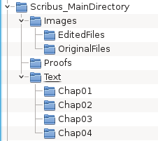
Preparing your sources
A good designer will want to have all the necessary content available in order to begin a document. A preliminary yet fundamental step is preparing your sources. This chapter will explain the various things involved in this preparation, before you begin your layout.
It makes sense that, as you begin a new document, you have already decided on the document length, in particular how it relates to the eventual printing plan. You should also have any content which you yourself have created, and that which you have gotten from other sources, including co-workers. You should always strive to gather as much of the material together as possible, for the following reasons:
- at the administrative level, you must know about the amount of material in order to define the various characteristics of the finished document, in particular in regard to it size (length) and the cost.
- from the creative point-of-view, having all the images and graphics helps you envision the document's overall aesthetics, and also know which elements you might be able to use and reuse.
- during production, you don't want to have unanswered questions about the content, which contributes to reduced anxiety, and consequently much greater ease while working.
What are the sources?
All the visual elements (photos, illustrations, and other graphics) plus the text used in your layout. Here we will distinguish between "graphical" sources and "text" sources.
Graphical sources
Graphical sources of a photographic type will come in one of two forms – paper or digital, and each needs a separate handling:
- If they are in paper (printed) format, they should be scanned at high resolution, then saved in a suitable format, such as PNG.
- If you happen to have negatives, there are scanners which can handle this.
- If they are digital, they might be initially received or saved on CD/DVD, on an external drive, or even on a local or internet server. However, if possible, put all your images in a folder in your local computer, which can always be deleted once the project is finished.
- If they are on a camera, then download them by the appropriate method. Typically they will be JPEG format, though possibly RAW (more flexible, but larger files).
There may be some sort of processing needed for your images, which will be covered below.
The other main graphic sources will be drawings, diagrams, maps, logos, and other elements created from scratch by you or some other designer. Ideally, these should be in some kind of vector format for the highest quality regardless of resizing.
The chapter Organize will give more details about organizing your sources.
In general, make sure that:
- you are able to load your graphics into editing software which you have at your disposal, such as Gimp (Open Source and Free), Photoshop (Proprietary), Inkscape (Open Source and Free), or Illustrator (Proprietary).
- they are of sufficient size and quality for your use – more details on this later.
Text sources
Text is of course fundamental in books. Text may come from a wide variety of sources – text editors, word processors, emails, web pages, or databases. Commonly used word processors are Libre Office, OpenOffice, or Word. It's important to know the source your text files.
- If you are getting text from several authors and maybe also made with several kinds of software, it will be good to say which format(s) you will accept, and perhaps merge them into a single format.
- Verify that you can import the text to Scribus or load on software you have to convert it to a usable format.
- Make sure you have the final version of the text to avoid the need for correcting or editing after you have started the layout. Even a few words added or deleted may make a big change in the layout somewhere. Make sure the text file contains no images, or that if they do, you have the images separately in their own files, and that you can load these into Scribus.
- Make sure you have the necessary credits and permissions to use the text and graphics.
Preparing sources
You may have quite a variety of formats for your text and graphics, yet there is variable suitability for use with Scribus. Be prepared for some modifications to something you can more easily work with. Three important considerations:
- Make sure the format is compatible with Scribus.
- Make sure the quality (e.g., resolution) is sufficient to the needs in your document.
- Using formats you are familiar with will make the layout process much easier and avoid unfortunate surprises.
File Formats
An important consideration in file formats is whether they are a standard, made to be shared from one piece of software to another, whether they include information about they were created, and in which kinds of software they can be expected to behave normally. In many proprietary formats, designed for use in proprietary software, some details of the format may be secret and cannot be used by other software.
All the formats listed here can be imported into Scribus. We restrict the list to those which are of adequate quality and therefore recommended.
| |
|
Type |
Benefits |
Downsides |
| Pic |
JPEG |
Standard |
Small, widely used
|
Variable quality
|
| |
PNG
|
W3C standard
|
Quality, can use transparency
|
|
| |
TIFF |
Standard |
Quality, can use clipping paths
|
Size of file
|
| |
PDF |
Standard |
Quality according to original doc
|
|
| |
PSD
|
Native Photoshop, Proprietary
|
Quality, very comprehensive
|
Size, proprietary
|
| Vector |
AI
|
Native Illustrator, Proprietary
|
|
Proprietary |
| |
EPS |
Standard |
Historical standard, widely used
|
Somewhat limited
|
| |
SVG |
W3C standard
|
Compatible will all software, web
|
May need colors adjusted
|
| Text |
DOC |
Native Word, Proprietary
|
|
Antiword required, limited
|
| |
ODT |
ISO standard, OpenOffice
|
Light, powerful, fully documented
|
|
| |
HTML |
W3C standard
|
Widely used
|
|
| |
TXT |
Standard |
Widely used, simple
|
|
Native formats are not designed to be imported by other software, and proprietary formats belong to the companies that created them. Especially since we see these proprietary formats change over time, using various open formats may increase the longevity of their usability for whatever purpose you may have.
More information on the benefits of using open formats can be found at www.openformats.org/en
Preparing images
Whether created by yourself or supplied to you from someone else, your images may need some processing. The goal is that they have these qualities:
- The format is importable and of sufficient quality.
- They have an appropriate resolution, so that at the end (the PDF) they are at least 200 to 300 dpi (dots per inch).
- They already have the appropriate dimensions, once the final place of their use is known.
The first two of these can be easily done with software such as Photoshop or Gimp. If you don't have much experience using these, and especially using them in an automated way, you might consult Phatch – photobatch.stani.be .
While it's customary in many professional workflows to convert images to CMYK color before using them, Scribus will make this conversion for you. Read the chapter on Color Management for further information on customizing this process.
After processing, you should save the images using names which inform you as to their content as an aid to identifying them when they are needed. Make sure you keep track of the information on credits or sources to include this in your layout as needed.
Preparing text
Text poses problems of a different kind. Word processors in common use typically focus on easy and rapid text entry, but various aspects of style are typically ordinary and involve little thought. In contrast, layout software is very much concerned with precise ideas about the style and appearance of the text – a customized look is desired. Much of the information contained in a word processor text file cannot be used by Scribus, since it's peculiar to the word processor software functions.
For this and other reasons, some prefer to only import plain text into Scribus. All word processors have an option to save the text in various formats including plain text (file extension .txt). In case the writer has applied various specific features here and there, such as headers, bold or italicized typefaces, be sure to keep track of these for adjustments to your layout, since these will not be included in a plain text file. An easy way might be to print out the text from the word processor.
If you are importing ODT files, font information and styles may be imported along with the text, but may require some time for adjustments after importation. DOC files will only be imported as plain text.
Regardless, you will need to carefully check for unexpected indentations or blank lines, or other sorts of errors in the text. Checking and correcting the file outside of Scribus will be easier than from within Scribus.
Quality Control
The purpose of quality control is to make sure that your layout will be exported to PDF following certain limitations and free of errors of various types, which is essential for graphic design production. There are three tools which help us: Preflight Verifier, PDF Export, and the Search-Replace function. The Preflight Verifier is configurable in File > Preferences > Preflight Verifier, and it looks for the following:
- Missing characters
- Objects which are placed somewhere off the page
- Text overflow
- Transparency
- Missing images
- Resolution of images
- PDF files contained in the layout
- Presence of GIF images
- Verification of PDF Annotations and Fields
- Ignoring unprintable layers
- Checking the difference between display and printing of layers
Preflight Verifier displays a dialog which will show each error it detects, along with the relevant page and object. The advantage is that it very easily will detect a host of errors your visual review may easily miss, and takes at most a few seconds to complete.
Once you are past this initial screen, you then proceed to the next step, PDF Export. The various options are explained in the chapter The Final Output. For our purposes here, we will say that this takes a few seconds to run the export function, and in some cases it may need to be repeated. This might come about after you examine the PDF on screen or in printed form.
What should you check?
Everything! Quality control requires a keen eye and for you to be mentally sharp. If you keep in mind that a Scribus document is really a set of instructions on how to build a PDF from various sources, you can realize the importance of having at hand all the materials you need. You are also mindful of the technical specifications for your layout, and you have already been checking, rechecking, and re-rechecking all of this as you create the layout. In this final check we are once again reviewing the technical specifications, on a practical level the geometry of the pages and the content. This includes the following:
- The number of pages
- Document format, with attention to the measurement units
- Margins
- Safety margins, allowing for the type of finishing, trimming, binding, etc.*
- Bleed
- The color space
- The number of colors
- The actual colors (plates)
- Resolution of images
- Ink coverage
- Black**
- Output profiles
- The presence of all the sources
- Typography – applying styles and typographic formatting, gaps, widow and orphans, typographical gray, hyphenation, and spaces
- Entering corrections
- Compliance with the stylebook as appropriate
- Compliance with all particular requirements of the project
If the document is to be printed, the final true test is viewing the actual printed output. A document created for the screen can only be checked on screen.
* Safety margins are not to be confused with document margins. This includes the tolerance of the finishing equipment, trimming and binding, gluing, and perforating. This will depend on the specific printing equipment, and should have been checked at the beginning of the design process, since it may affect the design and layout of page elements. More specifically, you don't want important content in areas susceptible to loss during finishing.
** There are many kinds of black, and you may in fact use different blacks in the same document and on the same page. Once your document has been printed out in quantity, these different blacks may be incompatible and at that point it's too late. Imagine you have a photo with a margin which fades to black, yet this turns out to be a different black than the background around it. An attempt at a sublime transition becomes ugly.
Proofreading
Copyediting and proofreading are related tasks. The former applies to reviewing the source materials for accuracy, grammar, and content. The latter, proofreading, as the name implies, happens after you have generated a proof of your work for a final assessment, not only of the issues checked during copyediting, but also fonts, layout, and all the visual aspects of the end product. You begin on bad footing with your reader if your work isn't coherent, concise, and pleasing to view and read. As it implies, copyediting is best done before your create your layout, set and adjust your styles, since this is the time when editing of the content is easiest. It also avoids creating other problems which might change the layout, such as when you significantly add or remove material.
This having been said, you may still find yourself changing the content in the proofreading stage. The choices for hyphenation may be inappropriate and need editing. You simply may miss some grammatical errors until this final stage. It may be that once you see the layout a change in the text content may improve the flow of text or deal with some ugliness like rivers or gaps in the lines of text. Thus, proofreading is also a very essential part of the editing process.
What about spell-checking?
Scribus has a built-in spell-checker [Item > Check Spelling], though it admittedly is a bit cumbersome. Typically, your word processing software will have a much easier to use and better spell-checker. Even so, as good as these are, they are not error-free, so it is up to you to find mistakes these automated utilities leave or create.
Entering corrections
Once errors are identified, they must be corrected. On a simple operative level, this only requires identifying an error, going to Edit Contents mode, and then going to and fixing the error. This seems simple enough, but requires rapt attention and efficient visual scanning.
You have at your disposal another tool in Scribus for this task: Search-Replace. Once you have selected a text frame, select Edit > Search/Replace.
The advantages include the fact that your errors will be found very quickly and without mistakes. You can start by simply entering the text to search for – it's not necessary to fill in all these fields. Immediately you will be presented with the appropriate location, then you may choose to enter the text to replace the error, and choose to replace one at a time or all subsequent errors also.
Requirements
In this book, we do not expect you to have previous experience with layout or computer graphics in general. To be sure, practical experience in visual arts (photography, drawing, and so on), or with commercial printing will undoubtedly help you to make beautiful things as well as understand various technical issues, but nonetheless all that is not necessary in order to learn to use Scribus.
However, in order to best make use of this manual and allow for the greatest ease of working, use a mouse with at least two buttons and a scrollwheel (avoid using a trackpad such as many laptops have), and a good, comfortable keyboard. This will allow you to work with one hand on the mouse and the other on the keyboard. This combination will frequently allow for the greatest precision as you work.
Beyond this, you may benefit from learning some keyboard shortcuts. This manual will only rarely refer to shortcuts, but primarily direct your sttention to various menus. Yet, if you will pay close attention to various menu items you will see notations about keyboard shortcuts for various tasks, to the right of the command name. Using at least some of these can easily speed up your work.
Otherwise, you should have a thorough understanding of the basic usage of your mouse and keyboard for typical typing tasks, navigating on the internet, and handling directories and files.
For whatever computer operating system you are using (Windows, OS X, Linux, and so on), be sure that you understand the following operations:
Mouse:
- Left button click (selects an item from a menu);
- Right button click (typically brings up some sort of context menu);
- Middle button click (or pressing the mousewheel, or both right and left buttons simultaneously);
- Click-drag (holding down a button in order to move an object on the page, then releasing, for example);
- Click-drag (making an imaginary box around a group of objects for example);
- Moving windows, dialogs, or frames on the display;
Mouse and keyboard:
- Usage of key combinations (Ctrl, Alt, Shift, ...) along with the mouse;
- Navigating from one menu to another;
File management: (to be covered in the chapter File Organization)
- Opening, saving, and moving files on your computer
- Create and organize directories, subdirectories, and files in a useful and sensible manner
- Knowing where your files are saved (understanding paths for files and directories)
Navigation:
- Knowing how to use hypertext links on the internet
If this list looks a bit frightening, don't worry – you probably know these operations with some other terminology. In case you have some doubts, a bit of research on the internet, or consulting some basic book on computer usage will certainly clarify these concepts, and you likely have family or friends who can show you these various operations. Otherwise, at some point you will simply need to jump in to begin your learning process – with practice will come greater ease in using any program.
Scripter and scripts
This chapter concerns information not needed by a new user, since it is what we would consider advanced usage. Nonetheless, it is worth reading through this chapter just so that you are aware of the capabilities of Scripter.
A script in our sense here is a small program which allows you to perform a series of operations in Scribus. The script is a text file which consists of a series of instructions, either in some highly automated way, or perhaps dependent on user input as the script runs. Scripts are especially useful for complex, repetitive tasks, especially when a number of objects need to be created and manipulated in a predictable pattern. You might create a basic layout and even add content. Scripts might also take existing content and perform a series of tedious actions on that content.
While you might simply use a script that someone else has written, you can also adapt an existing script to your specific needs. In fact, this can be a good way to introduce yourself to scripting, by modifying an existing script bit by bit. On the Scribus wiki you can find a number of Scripts for performing a variety of tasks you might have some interest in. All you need to do is create a file and copy the script into that file and save on your computer. Run the script by choosing from the menu Scripts > Execute Script..., then selecting your script file.
In Scribus, scripts are written in the Python programming language, and the script files should end in the extension .py, so your script file might be myscript.py. You will not damage Scribus even with a poorly written script, even though the script may fail to work or not work properly.
Like any programming language, Python has a vocabulary and syntax, and this takes some time to learn. Below you will see some resources to help you about Python.
Run a script
You should have a number of scripts included with your Scribus program, and you will see these listed under Scripts > Scribus Scripts.
- Autoquote – converts typewriter quotation marks to typographical quotation marks, and adapts to your chosen language.
- CalendarWizard – creates a calendar.
- color2csv – save to a csv file a list of the colors used in your document.
- ColorChart – creates a swatch from the colors in your document.
- csv2color – imports a list of colors saved in a csv file.
- DirectImageImport – creates an image frame and loads an image.
- FontSample – creates a document listing the fonts on your system with sample text.
- importcsv2table – imports the colors from a csv file to a created table.
- InfoBox – creates a text or image frame filling the width of one or more columns in a text frame. Loads an image if you wish.
You can modify these scripts according to your needs, the best method being to make a copy which you then edit. You can find the above scripts in:
Linux: /usr/share/scribus/scripts
Mac OSX: /Users/username/scribus/trunk/Scribus/scribus/plugins/scriptplugin/scripts/
Windows 7: C:\Program Files\Scribus1.4\share\scripts\
Create a folder, perhaps named Scripts, then when you click Scripts > Execute Script... you will know where to find them.
Add scripts
As stated above, the quickest and best way to find a variety of scripts in on the Scribus wiki (http://wiki.scribus.net), under the category Scripts. Not only should you find the scripts themselves, but typically instructions on using the script, such as whether you should have a document open and perhaps some object selected, or whether the script creates a document. There often are hints to the particular commands in a script and especially valuable is seeing the correct sequence of commands to make some object with particular properties.
For example, if you wanted to use the script from the wiki article Adding 'DRAFT' to a Document,
- First, open a plain text editor. An example is Gedit (which you can get and install from http://www.gedit.org).
- Go to the wiki article mentioned above.
- Highlight the actual script from that article, copy, then paste to Gedit.
- Save the file with the name draft.py
The script is now ready to use in Scribus.
- Make sure you have a document open.
- Scripts > Execute Script..., find the script on your system.
- Once you click OK the word DRAFT appears on the page.
Make your own scripts
If you can't find a script that meets your needs, you can write your own, or perhaps get someone who knows some Python programming to make it for you.
On the other hand, you might be able to simply modify an existing script, or combine features from two or more scripts already on the wiki, once you understand which commands produce which results.
For example, let's say that instead of the word 'DRAFT' you want the French 'BROUILLON'.
- At line 25 of your draft.py script is the command draft = "DRAFT".
- In front of the word draft type a #, which causes that line to be ignored by Python.
- Now at the beginning of line 27, remove the # so that now draft = 'BROUILLON' will be executed when the script runs.
- Save file and run it again.
Getting help and more information
All we have shown in this section is a brief overview of scripting. Here are some links which can get you started, and help when you get stuck on some issue.
Introduction to Python syntax
Check the manual included with Scribus: under Help > Scribus Manual > For Developers > Scripter, and also Scripter FAQ.
Some beginning Scribus Python scripts
Learning Python interactively
Official Python site
Python on Wikipedia
Python commands specific to Scribus
This is in the manual included with Scribus, under Help > Scribus Manual > For Developers > Scripter API
Getting human help!
Send a note to the Scribus mail list, where you might find your question answered by the community of developers and users: http://lists.scribus.net/mailman/listinfo/scribus . To send a message to the list, use this address: scribus@lists.scribus.net .
You can even discuss issues live on IRC, at chat.freenode.net, on the #scribus channel. If you've never used an IRC client, you might try out a link on the wiki site: http://wiki.scribus.net/canvas/Special:WebChat
Both the mail list and #scribus have the appearance that they might be English-only, but in case you struggle with English, there is typically someone able to answer most European languages.
The Scribus file format: .sla
This has nothing to do with Scripter, but we wanted to include in this chapter some information on the Scribus file format. the SLA format, like Scribus itself, is completely open, and in plain-text. It is similar to XML, and for that matter HTML, which you may be familiar with if you've ever looked at the HTML source with your browser. Because it is plain text, you can easily edit the file directly in a plain text editor.
SLA: an editable format
You should have no trouble finding your Scribus files, especially if you have followed our recommendations on organizing your projects, since they end with the extension .sla. You might be concerned about doing so, but feel free to open a file in a plain text editor. Take some time to notice the overall structure, which is quite complex even in small project, but there are tags which identify the various parts of your project, as well as the fonts used, styles, colors and so on.
In the example below we see a small section of a file where the color palette is listed. We can see that there are two spot colors listed, a PANTONE 541C and PANTONE 541C PALE. This would result in adding another color to the printing process, and of course an extra color means extra time and expense. What we really wanted was to use PANTONE 541C each time but with 50% saturation in the second instance. We can solve this quite easily by editing the file.
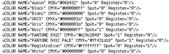
Below you can see how we have edited the file where the colors were used. In the second line, we delete PALE from the color name, then edit SHADE and SHADE2 values to 50 for our 50% saturation.

It is always good practice to make a copy of a file (save it under a slightly different name), so that if you make some mistake you still have the original. A badly edited file might not be able to be loaded by Scribus, and you would get a message that the file is corrupt. Even so, if necessary, you should be able to get help in fixing your file, if you cannot fix it yourself.
Selecting fonts
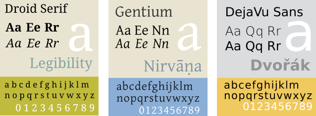
In typography, there are a number of terms one runs across, and it's easy to confuse one with another. You may have heard of names like Times, Garamond, Helvetica, Futura, DejaVu, and Droid. We can consider these as "font families". For example, in the DejaVu font family or typeface, we have Sans, Serif, Sans Condensed, and under each of these we may have a bold, or italics, or regular (often termed "Book") style. Then in a given document we may have 12 point or some other size of typeface. Strictly speaking, when we specify a font, it might be DejaVu Sans, Bold, and 10 pt.
It's also good not to confuse characters and glyphs. A character is the letter, number, or symbol one is trying to create. "A" and "B" are two different characters. A glyph is the representation of that character in some particular typeface, so that an "A" in Garamond is a different glyph than an "A" in DejaVu Sans, even though they are the same character.
Historically, of course, printers had and were able to make font sets, cast from lead, which they used until they became so worn they had to be recast. With modern printing methods, these have disappeared and have been replaced with computerized methods for creating fonts of any size and style.
Fonts today
Even though typeface creation no longer involves pouring lead into a cast, we still use the term "font foundry" to apply to the companies who make it their business to create computerized versions of typefaces.
Font characteristics
Most of the typefaces you will see will be either serif or sans serif (often abbreviated as sans). Serifs are small appendages at the various tails of letters, designed to make letters more distinctive. One challenge any typeface encounters is its legibility, or in other words, the ability to discern one character from another. Another is readability, which refers to the ease of reading a body of text. Each of these contributes to some extent to the fatigue one feels in reading large amounts of text, since poor legibility and readability lead to slow reading as well as rereading.


Here we see on top a Serif font, with the serifs highlighted. Below, a Sans Serif font.
Although there are some who feel that serif fonts have better readability, this has not been conclusively proven. There may be some tendency to favor Sans typefaces on the web, and Serif for print, but even this has no clear cut division, especially as we have increasingly high resolution screens to work with.
Letter spacing
Letter spacing in our context here refers to the space between individual letters, for which there are two general schemes, Proportional and Monospaced.
Here is shown the chief difference between these two types, with variable spacing between letters in the proportional typeface. Monospaced typefaces are similar to what may come from a typewriter, and can be useful when vertical alignment of characters is needed.
The main font families
With what we have said as a starting point, it is worth listing the main types of font families in common usage:
- Serif
- Sans serif, or Sans
- Monospaced, or Mono
- Cursive or Script, meant to resemble handwritten characters
- Ornamental or decorative, sometimes with very exotic distortions of glyphs
- Symbols, typically not alphanumeric characters. Dingbats is an example.
Weight
You should be familiar with Bold versus Regular (or Book), but there is a wide range of thicknesses of the glyphs, such as in addition Thin, Light, Demi-Bold, Heavy, and Black.
Italics and oblique
Italics are smaller size glyphs which are generally also more compactly printed, one of the reasons for which being to allow for a greater amount of text per printed page, something of concern when paper and other printing media were more expensive than now. Currently, italics is often used for emphasis, as an alternative or combined with a heavier typeface.
An oblique typeface will also be slanted, but will likely have a spacing similar to the regular version.
Some programs, such as word processors, may artificially create italics and oblique fonts from regular typeface, but for professional layout you should use italics specifically created as a separate typeface, and Scribus will only use an italics typeface specifically created as an italics typeface.
Font files
The fonts which your computer is able to use are contained in a number of files, which consist of the metrics for the font, in other words, the instructions for your computer to create them on screen and for export as a PDF for printing. In case it isn't apparent from the above, Scribus will need a set of metrics for each version of a typeface in order to use it. Therefore, for example, you will need a separate set of metrics for each of the following – DejaVu Sans Book, DejaVu Sans Bold, DejaVu Sans Bold Italic, DejaVu Sans Condensed, DejaVu Sans Condensed Bold, and so on.
There are 3 main categories of font files you will see: TrueType (extension .ttf), OpenType (extension .otf), and PostScript (extension .pfm or .pfb).
Installing new fonts
You should already have a number of fonts on your system, but to install additional fonts there are different procedures depending on your operating system:
- Windows 7/Vista – right-click on the file, choose InstallI.
- Windows XP – put the files into C:\Windows\Fonts
- Mac OS X – double-click on the file, then click button Install font.
- Linux – copy the folder containing the font family to /usr/share/fonts. You may also have a package for the font which can be automatically installed, depending on which version of Linux you are using.
If Scribus is running while you are installing a new font, you will need to restart it, since startup is when Scribus searches for fonts on your system.
Using a custom folder
You can install fonts in almost any location on your computer, but you will then need to tell Scribus about them. After starting Scribus, click File > Preferences > Fonts. You must do this with no document open, then select the Additional Paths tab to help Scribus locate your fonts.
Which fonts should you use?
A guiding principle in your layout is to avoid using a large number of different fonts, even though you may be tempted to try out any number of those fonts sitting in your computer. Use of too many fonts is first of all distracting, but as you become more experienced, you will also see that it is unattractive and takes away from the pleasing and coherent visual appearance you are trying to create.
It should rarely be necessary or desirable to use more than 2 or 3 fonts for most documents. Furthermore, it's a good idea to choose these ahead of time, since the type of font may play a role in the design process of other visual elements. A typical set of choices might be one font for headlines, another for subheadings, and a third for the text body.
Here are some additional essential characteristics you must consider:
- Does the font contain all of the characters I need? Different typefaces will have a variable extent of coverage for various languages or even for special characters like fractions or the copyright symbol.
- Is the encoding correct? Here you want to make sure that when you enter a particular character from your keyboard the correct glyph is shown.
- Are the glyphs appropriate for my use? You should run a test to see that, after export to PDF, the legibility is adequate for your needs. For example, some fonts designed for the web are not of sufficient quality for use in printed material.
- Is this a reliable, good font? Some fonts are simply better designed than others. A better designed font has letter spacing carefully created to allow characters to have a nice, even display in various combinations of glyphs. Again, looking at some sample text in an exported PDF is your best test.
Scribus runs some testing on fonts to ensure they meet some basic quality checks, but this is no replacement for some manual checks on your own. You certainly want to find out about problems with a font as soon as possible in the design and layout process, and not wait until you have gotten to the finished product.
To some extent, there is probably a greater likelihood of some issues with fonts having a huge number of glyphs, due to the work it takes to carefully design so many.
At the present time, Scribus does not adequately support non-Latin languages other than Cyrillic, but this is under active development.
Get help from a font manager
Even a basic system may have dozens of fonts included, and with time you may find you have hundreds, so using a font manager can help you sift through this for the 2 or 3 that you will use in your document.
What these allow for is an easy ability to scan the various glyphs, along with a classification of the font type, and to read metadata, including licensing for the font. Just because a font is free doesn't necessarily mean it allows unrestricted use. In addition, you can use the manager to inactivate fonts you do not want to use, which shortens the list of possible choices.
One such font manager easily available and recommended is Fontmatrix, found at http://fontmatrix.net/, and which has versions for Linux, Windows, and Mac OS X.
An alternative, a bit more simple, is Font manager http://code.google.com/font-manager/
What happens when I open a Scribus document which uses fonts not on my computer?
This might come about when you use a different computer from the the one you created the document on originally, or when you receive a document from someone else.
As soon as a document is loaded, Scribus checks to see that all of its fonts are present on your system. For each that is missing, you will see a dialog appear, suggesting a substitution, or with which you can choose some other font which you do have on your system.
Some reliable fonts to begin with
As we have noted above, not all fonts you may find are adequate for DTP purposes. Here we give a short list of free fonts with open licensing which you can expect to give you quality results in your PDFs.
- Liberation is a font family developed by Red Hat as an alternative to the proprietary Arial, Arial Narrow, Times New Roman, and Courier New. Since they were developed together they show a good consistency of style between them. This family includes Liberation Sans, Liberation Sans Narrow, Liberation Serif, and Liberation Mono.
To download: https://fedora-hosted.org/liberation-fonts/
License: GPL v2, with exception for fonts
- Droid is a font family developed for the Android operating system, consisting of Droid Sans, Droid Serif, and Droid Mono. As with the Liberation family, the fact they were developed together contributes to consistency.
To download: http://www.droidfonts.com/
License: Apache License v2
- Gentium a very attractive font family developed by Victor Gaultney, and which has some similarities to the classic Garamond font. The family includes Alternative Gentium, Gentium Basic, Gentium Book Basic, Gentium Plus, and Gentium Plus Compact.
To download: http://scripts.sil.org/gentium/
License: SIL Open Font License (OFL)
- DejaVu is a font family based on Bitstream Vera, which has a good track record used onscreen. One of its highlights is a huge selection of glyphs – if you need something unusual, check DejaVu. It includes DejaVu Sans, DejaVu Sans Condensed, DejaVu Serif, and DejaVu Mono.
To download: http://dejavu-fonts.org/wiki/Main_Page/
License: specific permissive license, available at http://dejavu-fonts.org/wiki/License
- Cantarell is a modern and complete font designed by Dave Crossland, with variations and Bold Oblique.
To download: http://abattis.org/cantarell/
License: SIL Open Font License (OFL)
Finding free fonts
Here are three reliable sources of good quality fonts:
A reminder: always check the license of your font before you use it, to be sure that it meets your needs.
Styles
Depending on the type of document you are working on, the process of design can be optimized by automating common tasks.
When the amount of text is great, and it has a consistent structure, as far as header, titles, blockquotes, captions, and so on, then styles are by far the best tool for easily applying these features. With a single click, you can apply the various font parameters you have been using throughout your document.
There are several advantages to using styles:
- They improve productivity
- They greatly simplify making last minute changes to a text appearance document-wide
- They allow for a consistent appearance from one part of a document to another and from one issue or edition to the next
- They allow for coordinating captions with the graphics to which they refer
- They allow for a more pleasing experience on the reader's part
- They easily allow for coordination of work by a team working on the same document
About the only disadvantage is the time it takes to plan and create these various styles, but even here there is an easy allowance to adjust your style later, so less pressure to get the style "exactly right" the first time.
Creating styles
Making a simple style is actually a very quick process. It takes no more time than setting various font and typography characteristics with the Properties palette, and you end up with something you can immediately reuse somewhere else.
Tip: It's good practice to begin making styles as you begin a document. Think about some basic elements such as the text body, headings, captions, and make some reasonable attempt at these. Remember, you can easily alter these later once your document begins to take shape.
The Style Manager consists of two main parts. When you initially open it with Edit > Styles from the menu, you see this smaller part shown above, where you may select a style and act upon it (Edit), or create a new one (New).
To create a style of whatever type requires a few steps:
- Bring up the Style Manager with Edit Styles.
- Click the New button, then from the drop-down list choose the type of style you wish to create.
- The dialog now expands as shown below for creating a Character Style.
- Change the name to something meaningful for its use. It's probably best not to incorporate the font name in the style name, since at some later point you might switch to another font for your headings, for example.
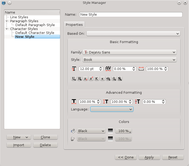
Character Styles
Character Styles and Paragraph Styles are related, but not exactly the same. A Character Style has to do with the particular attributes we have set for the font, such as the typeface, its weight, size, kerning, whether it might be underlined, struck through, and the other features you see above.
One feature of a Paragraph Style is that it also implies an associated Character Style, but the reverse is not true. Thus we can use a Character Style to modify the appearance of a font in mid-sentence without affecting the structure of its paragraph or the font elsewhere in that sentence.
Consider, for example, a situation where you may have some text which contains numbers referring to some statistics. Since you want these to stand out from the surrounding text, you change the typeface, or weight. Using the Properties palette, you could highlight these one-by-one, then modify settings as needed. If you use styles, however, you make the settings once, then simply apply the Character Style, and if later you modify the style, it is immediately applied everywhere it was used.
So to be more specific:
- Bring up the Style Manager with Edit > Styles.
- Click New, then choose from the drop-down list Character Style.
- Replace the default name New Style with StatisticalNumerals.
- Select your font, its weight, then farther down its color. Your list of colors here is the same color palette you use elsewhere.
- Change any other properties as you see fit, then click Done. If later you edit your style, you can click Apply to apply the changes wherever it is used.
Paragraph Styles
As was stated above, the settings for a Paragraph Style include those for its associated Character Style.
As its name suggests, Paragraph Style is applied to an entire paragraph of text. What may be less obvious is that, in addition to the features of a character style, you also may set linespacing, indentation, presence of drop caps, optical margins, space above or below a paragraph, justification, and tabs.
- Open the Style Manager with Edit > Styles.
- Click New, then choose from the drop-down list Paragraph Style.
- Replace the default name New Style with, for example, Title.
- In the Properties tab, choose the various parameters to your liking.
- You may also select the Character Style tab for all the various adjustments in the font, etc.
Line Styles
Although less commonly used, Line Styles can also be useful for maintaining a consistent appearance to frame borders, or any lines which you may use in your document.
- Open the Style Manager with Edit > Styles.
- Click New, then choose from the drop-down list Line Style.
- Replace the default name New Style with, for example, Framed Quote.
- In the Properties tab, choose the various parameters to your liking.
Applying Styles
Once you have created your styles, they are available in selected locations for their application.
Paragraph and Character Styles
These are both available in the Properties palette, under Text > Style Settings. Use some caution, so that you understand how to apply each style from its drop down list. There is also some importance of the order in which to apply styles.
- First, apply your Paragraph Style.
- Next, select the appropriate text and apply a Character Style.
- At this point, you might still wish to make some minor adjustments by adjusting various parameters in the Text tab elsewhere.
If you notice trouble reverting in case you have made a mistake, you should try the Remove Direct Paragraph/Character Formatting buttons (with the broom icon), to attempt to undo some application of a style. Going back to default styles may also help.
The other place to apply Paragraph Styles (but not Character Styles) is in the Story Editor, where you can, paragraph by paragraph, apply styles.
Line Styles
There is only one place to apply a Line Style, in the Line tab of Properties palette. Simply select your object, and choose the style from the list. If it's a frame, the style is applied to the border.
Editing Styles
Chances are, you have already seen the Edit button in the Style Manager dialog.
- Open the Style Manager with Edit > Styles.
- Click on the style you wish to edit, then click the Edit button.
- Make your changes, then click the Apply button, and your edits are applied wherever that style is used. This shows the dramatic benefit from making use of styles in your workflow.
In case you might import text from ODT or HTML formats, you will likely see that some new styles appear in your list. You may want to check these styles and adjust as needed, or you may find you can substitute some style you have created, then delete them.
Deleting Styles
- Open the Style Manager.
- Select a style, then click the Delete button. Alternatively, right-click the style you wish to delete and choose Delete from the list that appears.
- You will have a choice here to substitute some other style for the one you are deleting.
Importing Styles from other documents
In case you haven't already seen the benefits gained from using styles, you can also reuse styles you have created in some other document.
- Open the Style Manager.
- Select Import.
- A file dialog appears, and you next choose the document file from which you wish to import one or more styles.
- Scribus presumes you will import all of them (not likely), but simply uncheck the ones you wish to import to the current document.
- In case you are importing a style with a name matching one already in use, the default behavior will be to rename the imported font, but you may choose to replace the existing font of that name.
Note that if the imported style uses a color not in your palette, that color will be imported as well.
Text flow and typography
By default, frames in Scribus have a rectangular shape. This is what you want in most cases, and is well-adapted to creating a structured composition. Thus, one can easily place text and images side-by-side.
If you wish to increase the dynamism of the layout, frames can be made to overlap:
- You may add a text frame to highlight some point.
- You may select some text, then place it in a separate frame for emphasis.
- You wish to put the image inside the space where text already exists.
What you find in these cases, is that the new frame is on top of text content, and what you really want is for the text to flow around the frame, which may have an irregular shape.
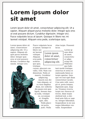
Text Flow
Except for special cases, text flow is applied to the object, image, text, or geometric shape, which is overlying the text – on some level above the text.
Enabling text flow
Remember, this is applied to the object above the text which must flow around, so select that upper level object. Now, in the Properties palette, select the Shape tab.
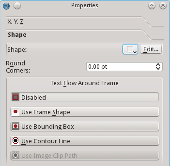
Your four options:
- Use Frame Shape uses the boundaries of the frame you created in the object.
- Use Bounding Box will be the same as the Frame Shape for an unrotated rectangle, but in the case of an irregular shape or rotated rectangle, the Bounding Box delimits the horizontal and vertical boundaries of all the elements of the object, including control points.
- Use Contour Line uses an editable shape which initially is the same as the frame shape.
- Use Image Clip Path uses the clipping path of an image, when one exists. Not only must the path exist, but it must have been activated in the Extended Properties of the image.
Since it's important to apply text flow to a frame on a higher level, it's important to remember that as you add frames, they are placed on a level above the last frame created.
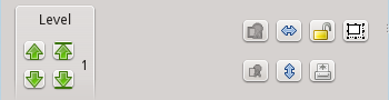
Here we see in this small part of the XYZ tab of Properties how to adjust the level of an object. The left up and down arrows shift by one level, the right arrows either all the way to the top or to the bottom. The number beside the arrows indicates the level of the selected object, 1 being the lowest level.
Adding space around an image
By default, text flow would be immediately against the edge of the image or text frame, but in most cases you will want some "breathing room", such as you see in the example page above.
- Click Edit in the Shape tab. You should then see blue dots appear at the corners to mark the Nodes.
- Select Edit Contour Line at the bottom of the dialog.
- Adjust the spinbox with the percentage (10% here), to your desired amount of change in size.
- Now click the button to increase the size of the contour line – the tooltip for the button says, Enlarge the Size of the Path by shown %. The button shows a rectangle with arrows pointing outward. If you wish you can repeat clicking to get the effect you need, then click End Editing.
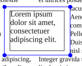
If you are going to use a border for your frame as you see here, you will want to add some space above and to the left of the text inside the frame. Go to Properties > Text > Columns and Text Distances, and adjust the distances as needed.
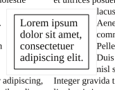
Add a caption
Scribus doesn't yet support text flow around a group of objects. If you want text to flow around an image, then add a caption to the image, here are a couple of work around methods:
- Place a transparent text frame behind the image, then set text flow around the new frame, positioning the image over it to get your desired effect.
- Place a frame inside the image frame, enlarging the image frame so that the caption is inside any border. You may have to disable Adjust Image to Frame to do this.
Changing the shape of frames
You may notice that when you attempt to change the size of the contour line that the desired effect doesn't take place. In this case, Undo your edits and make sure you have checked Edit Contour Line in the Edit dialog. Also check to make sure you have selected Use Contour Line for the text flow setting.
Should you wish to change the shape of frames, this is accomplished with the buttons in the upper part of the Edit Shape dialog. The functions here are complex and require some practice to master, but here is some information to get you started.
- The first button in the top row allows you to move the nodes (blue dots), and you can do this directly with the mouse, or in the X-Pos and Y-Pos spinboxes lower down in the dialog.
- The second button allows you to add nodes to the shape.
- The third allows deletion of nodes.
- The first button in the second row allows for editing of control points for the nodes. Control points with be colored pink and adjust the line between nodes so that it curves between them.
More information about editing shapes can be found in the online manual that comes with Scribus.
Typographic considerations
Whenever you narrow a column of text you run the risk of the various problems pointed out in the chapter on Typography. Refer to that chapter where the possible ways of adjusting your text are covered in detail.
The final output
Now we come to the final stage before the creation of a printed document, which involves incorporating all of our sources (text, fonts, and images) into the final fixed layout, and in addition, application of the appropriate color profiles for the intended results.
Format choices
In most cases, PDF has emerged as the most widely accepted format for all those working in the graphic chain. PDF is an ISO standard by virtue of its carefully directed structure, and its files have a compact size, considering the richness of the content, the vectorized flexibility, and its universal acceptance across many different systems.
There are other formats available through File > Export:
- PostScript actually predates PDF, and was the original widely used format for desktop publishing, aided by the fact that many printers were designed to accept PS input to create documents. Although not as flexible as PDF, it is still used by Scribus as an output format for directly printing from Scribus.
- EPS, or Encapsulated PostScript, rather than defining the placement of items in a document, places them in a container for some greater flexibility. EPS suffers a bit from having customized versions on some systems.
- A potential image format might also be useful is to save as a TIFF, which will flatten transparencies. This is a bitmap, not vector format, and thus high resolution files may be quite large.
- SVG is a new format, vector type, and highly flexible, but in part because of its newness has not become universally accepted or usable.
Selecting File > Export > Save as PDF opens a dialog with multiple tabs and options, perhaps a bit bewildering to the new user, yet does offer some default settings which are useful for many printing tasks.
General options
The first tab shows a number of options, which are at the core of the settings needed for the file we present to the printer. While the default setting may be the correct ones for many situations, we may well which to change a few for the desired results. The following, then, will cover a number of these settings for your consideration.
PDF version
There are now many flavors of PDFs, as the format has evolved to include various features related to its content and structure. Scribus allows for selection of various types according to the needs you have based on the content of your document.
With each version name you will see a corresponding version of Acrobat, in which the PDF version was introduced. If you document does not include any transparency, you might choose version 1.3, since it did not allow transparency. Transparency was introduced as of version 1.4, and multilayered documents with version 1.5, so your document may dictate one of these as a choice. PDF/X-3 is based on 1.3, but includes the need for color management to be activated.
An important and very basic consideration when deciding on a PDF version is what is recommended by your printer. In many cases this overrides any other choices, since you cannot use a format your printer will not or cannot accept.
Compression and resolution
Here at the export stage, you must again consider the resolution of images in your document. For most purposes, a minimum resolution should be 300 dpi. This is why the resolution for EPS graphics defaults to this setting. Any EPS images contained in your document may contain vectorized elements, so this setting may be important for your output.
In addition, there is the setting for Compress Text and Vector Graphics which may help to limit the size of the PDF from these elements.
At the bottom of the General tab is a section for choosing the Image Compression Method and its settings, again with the idea to have sufficient resolution, yet if possible reduce the size of the final file, since image data is embedded in the PDF.
As far as Compression Method specifically, a lossy type such as JPEG allows for more reduction in file size, but runs the risk of data loss and degradation of the image in the PDF. A better choice might be the lossless or ZIP for greater image fidelity. On the other hand, if the final file is to be viewed on screen, image quality may be less an issue, since screens typically have a maximum resolution of 96 dpi.
Finally, you may also choose the Maximum Resolution, by default set at 300 dpi. While you might leave this item unchecked as it is in the default, this could be useful if you are using very large images in order to reduce file size.
Fonts
You cannot depend on your fonts being present on the system which is viewing or printing your document. If they are not present, substitutions will be made. To avoid this, you have two options:
- Embedding fonts. This is the ideal choice whenever possible.
- Outlining fonts. Some types of fonts may not allow embedding, or the license for the font may not permit it, in which case this is your next best alternative. Outlining amounts to creating vector graphical images of each glyph, and including them as graphical data.
Color
The Color tab offers a series of choices which determine the application of color profiles in your PDF. As you can see, in the default Screen/Web choice for output intent, you have no options, which only come into play when you choose Printer, where you will be making conversions to CMYK.
Converting spot colors
In some print workflows, you are paying for the number of ink colors you use. If you use a spot color, this is an additional ink. This setting allows you to convert a spot color to CMYK for cost-saving. If your document is not already CMYK, perhaps a duotone, you should probably stay with a spot color to avoid converting your duotone to CMYK. Make sure you understand what you are doing, and consult your printer if you are not sure.
Custom rendering
Selecting Use Custom Rendering Settings will allow adjustment of settings for changing the angle, frequency, and shape of the printing dots (of ink). Since the default settings are generally correct, it is not recommended to alter these unless you have specific instructions from your printer.
Application of color profiles
Here we are making a conscious decision to alter the previously determined color profiles, with the knowledge that you may change the results from that expected. This is the point when we can choose to ignore an embedded image color profile, and possibly even load a different one for use in creating the PDF.
Pre-Press settings
This tab allows you to configure various elements used in the process of physically printing your document, as well as demarcate areas for trimming and finishing the paper for the final product.
- Crop marks define the extent of your final document after trimming. Anything outside the marks will be removed in the trimming process.
- Bleed marks are similar to crop marks, but define the area inside which you create your layout. This allows you to make sure that decorative elements or images will go completely to the edge of the cut page, by overlapping into the bleed area. It is possible here to alter the bleed settings from those you chose in creating your document.
- Registration marks allow for the alignment of the printing inks in a multistep printing process.
- Color bars will show the array of colors used in the document.
- Page information includes the name of the document, date of creation, and page number.
- PDF/X3 Output Intent will only be available if you have made this selection in General settings, and allows the choice of a specific profile for global output. This will necessarily be a CMYK color profile.
Other document options
There are some further settings which will have no relationship to the printing of the document, but apply to situations when a PDF may be digitally transmitted and viewed electronically. These are included in the Viewer and Security tabs, the latter being greyed out if you have chosed PDF/X-3 compatibility in the General tab.
Settings in the Viewer tab determine various display properties onscreen to allow for easier manipulation and reading of the document. In addition, Special Actions allows for running some JavaScript to open the PDF or to pre-populate fields in a PDF form.
Print to a file
Printing to a file allows for applying some specific options which do not happen in the creation of a PDF. These are more applicable to the actual procedure of printing (impression) of a document. Instead of actually physically printing, a PostScript file is created with the information one might use in the actual printing procedure.
Once you select File > Print, choose File as your Print Destination, then enter the name of the file.
The Options tab allows you to choose Print Normal (all colors), or Separations, where you may select individual CMYK inks to save in the file. There are three levels of PostScript export to choose from, the highest being level 3.
In the Advanced Options tab, there are some limited choices under Page, and also some Color options. Change Page options only on the advice of your printer. Color offers some settings we saw in PDF export, to convert spot colors to process, and also to apply color profiles. In addition, there is Apply Under Color Removal, to reduce excessively rich black. What this does is convert gray from a mixture of CMY inks to black, thus reducing the amount of ink coverage to reduce smudging.
The Marks tab offers the selection of marks seen in PDF export, but adds the ability to apply an Offset.
Finally, Bleeds allows for changing from the bleed settings for the document.
When you then click Print, you create a file which can then be used by specialized software that can convert the created PS file to PDF in the printing process. These include Moonshiner, GSView, and Distiller.
Print Preview
Getting a preview of your printed output is of unquestionable value. Your preview may give some indications of color problems in the final output. By selecting File > Print Preview, you have an opportunity to actually see the results of the various choices you make in PDF export as shown above.
Display settings
These are used to customize the preview of the document. Enable Antialiasing improves the display of vector elements, fonts, shapes, and graphics. It can be useful for visually assessing overlays and knockouts.
In addition, there are Display Transparencies and Display CMYK, the latter to selectively show individual cyan, magenta, yellow, and black ink layers in the document, as well as how they interact in the document. Keep in mind that your view is an RGB simulation of CMYK, thus not quite the same thing.
The display includes the ability to assess ink coverage, especially where there is superimposition of vector shapes or text over a background color.
Preview settings
We have the various settings already discussed in Print to a file, except that here we have the opportunity to actually visualize the results of these choices to anticipate how these will affect the printed document.
Typography and Scribus
We now approach the core of Scribus. The ability to handle advanced features of typography is an absolute essential requirement of professional-quality DTP, and an area where Scribus excels.
First of all, we would point out that you will find an array of settings available in the Properties palette, and some additional features elsewhere, such as in the Styles Editor, and you should consider these complementary to each other for your needs.
Text as a process
Consider that page layout is a carefully arranged display or staging of your content. First, you wish to capture the eye of your reader, then guide him through the page in an organized way. If organization is lacking, if there is no cohesive idea to the layout, the reader has trouble grasping the content and quickly loses interest. Loss of interest means you have lost the message you were trying to transmit.
This is why there is a certain hierarchy to text. This doesn't mean there is a static structure that you use every time, but the designer nonetheless creates some sort of order in the way that the text is handled and presented. Here we are not going to make a case for some particular pattern or choices, but rather discuss the various choices you have available to you within Scribus.
Below is a list of various choices which might occur in publications. While it's not so likely to use all of these in any given design, typically a number of these will be used. If you look at various publications at your disposal, you should see many of these in action.
- Body text
- Photo or illustration legends
- Credits
- Headings
- Headlines
- Titles and subtitles
- Epigraphs
- Citations
- Indented text
- Bulleted lists
- Numbered lists
- Footnotes
What you will find is that each of these categories has certain typographic characteristics. Your job as designer is to determine these various attributes. This isn't a matter of having some predetermined formula, yet as we have said, there must be a hierarchy in the appearance. For example, the title should be prominent have some punch to it to grab the reader. Titles and subtitles should offer some interesting contrast from the headlines. You can't necessarily consider the text in a strictly linear way, to be read top to bottom, start to finish, but rather allow for the reader to capture some context, and the typographic features guiding him along. You may use color, contrast, shadows, and even white space, hopefully in subtle ways, to keep the reader's interest.
The areas of body text are the quiet areas of the layout, which promote ease of reading without leading to visual fatigue. Headings, titles, and illustrations and captions function to help break up the monotony of the text and keep the reader's interest.
Typographic attributes
What follows are the various aspects of your typographic palette. Consider them to be the contents of your toolbox to showcase your text. Try not to remain in your comfort zone, but experiment with all of them so that you become familiar with their implementation.
The drop cap
Drop caps will be something of a show piece of your layout. The reader's eye will be drawn to this large first letter of a paragraph, which will likely be bold, and may even have a different typeface and color from the body text. While there are ways to artificially create drop caps, the most convenient way is to create this as part of a paragraph style. Simply check Drop Caps, then select the number of lines you wish the drop cap to cover. Adjust Distance from Text as desired. Since this paragraph style applies to the entire paragraph, if you wish to change the font or its color only for the drop cap, you will need to do this from the Properties palette by highlighting letter and editing.
A recommendation to consider is that in addition you edit the remainder of the first word of the paragraph so that it is in small caps. In the case of the first word being an article such as A or The, then also make the next word small caps. The Properties palette has a setting for small caps, but a few fonts will also have a small caps style, the more preferable alternative. Note the difference in the examples below.
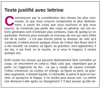
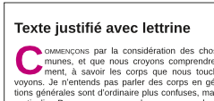
A final note of caution about drop caps – don't overuse them. Do not use your drop cap style in every paragraph of body text, maybe only the first paragraph of a multiparagraph or multipage article. For this reason make a separate modified version with drop caps of your main body text paragraph style, so you apply it sparingly.
Ligatures are a special glyph combining certain combinations of adjacent letters, such as "œ" for example. In order to use these, you must have these special glyphs in your chosen typeface. While they can be entered directly if your keyboard allows, if you know the Unicode value, press Ctrl+Shift+U, then enter the 4-digit Unicode number (such as 00e6 for œ). Otherwise, you can from the menu Insert > Glyph, then find your glyph by that method. Once you find it, notice that Scribus shows a tooltip with the Unicode value you might use the next time.
Old style numerals, typically set below the baseline, are an uncommon glyph, so therefore you must see whether your chosen font includes these. From the menu, Insert > Glyph.
The settings for superscripts and subscripts are found in File > Preferences > Typography. Here you have two settings, one for displacement, the other for percentage scaling of the letter or number. There is only one setting allowed for each, so that this will be applied globally for all instances.
Quotes and apostrophes require special attention. These are not the similar characters which you might enter from your keyboard, but rather, specific typographic curved forms. There are specific left and right versions, and each language uses its own versions of these. If you are importing an ODT file, for example, these conversions may have already been made. Otherwise, you should convert these with Insert > Quote, where you will see the full range of possible choices. There is also an included script, Autoquote, which you may find useful for automatically converting typewriter quotes to typographical quotes.
Typographical spaces
If you look at the list which you see with Insert > Space, you may be surprised at the large number of different choices you have for something as "simple" as a space. Two which are commonly in use are thin spaces and non-breaking spaces. When you want thin spaces, unfortunately this is a manual operation, where you must insert each, one at a time. You might use this as a manual form of microtypography.
For non-breaking spaces, you have a powerful tool at your disposal, which you can apply with Extras > Short Words. Before using it, you should check File > Preferences > Short Words, where under your chosen language you will find a list of short words or abbreviations which will be searched for and the rule applied, such as in the French examples below. For example, if "Dr. " is encountered, the plugin ensures that a non-breaking space is placed between the title and the person's name, so these are not inadvertently separated by a line break. Similarly, a number followed by " kg" would not separate the number and its units.
The structure of the list is that each entry must be followed by a comma, and furthermore must include a space which will indicate where the non-breaking space is to be placed. Therefore, we see a space after Dr., and a space before kg. If you don't agree with any of these you can change them, but don't forget to save your edits. You can of course also choose not to apply this plugin with Extras > Short Words.
If you do make what you consider important changes in this file in Preferences, you might share this on http://bugs.scribus.net so that others might make the same modifications.
Alignment and justification
There are 5 kinds of justification or alignment in Scribus. Just below the button for linespacing are the icon buttons for selecting your alignment, mostly intuitive, except for the fifth one, which we will explain here. You may select justification either in Properties > Text or in Edit > Styles, or in Story Editor.
Left alignment – this is suitable for titles and headings.
Right alignment – might be used for an author's name after a block of text.
Justification – this refers to arranging the letters on the lines of paragraphs so that they fill the line edge to edge. In printing, we may describe justification according to the width of a column, for example, we might say that the text is justified for x picas. The icon for full justification depicts how the text fills the lines to the left and right edges, with the exception of the last line, which aligns either to the left or right, depending on the direction appropriate for a given language. This is the typical method used for magazines and newspapers, and allows for easy legibility and readability. Columns of text have something of a visual monotony, which helps one see the information in blocks highlighted by the titles or headings. We can also appreciate that from full justification comes the term typographical gray, to refer to a sense of the overall darkness or grayness of a block of text. Thus these areas of visual calm and gray appearance allow the headings and graphics to stand out and capture our attention.
The three examples below illustrate uses of full justification. Notice that in the example where there is no indentation that extra space is created between paragraphs – this can only be achieved with the creation of Paragraph Styles, which is only possible through the Style Editor. In addition, indentation or hanging indentation can only be created with Paragraph Styles in the Style Editor.
Three variants using justified text
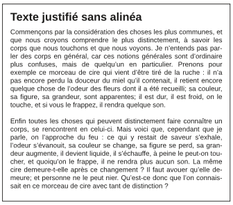
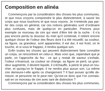
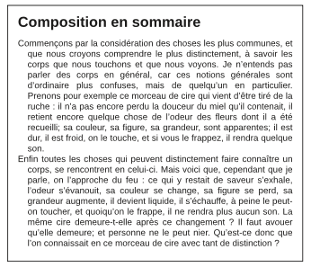
To obtain a hanging indentation such as in the last example (Composition en sommaire), you must first indent the body of the paragraph some positive value, then indent the first line of the paragraph some negative amount, whose absolute value is no greater than the indentation of the body.
It is essential to familiarize yourself with these various settings, so that you can combine them as needed to achieve your desired effect. For example, in situations where you may place a quote or summary in a block of text, you may wish to set apart with some extra space before and after the paragraph.
The fifth choice, forced justification, is something of a trap for some people. In this case, even the last line of your paragraph is fully justified, created a solid rectangular block of text. This might be used for some special effect, but rarely used in practice.
Numbered list, bulleted lists
Scribus has facility for creating lists, but this must be set up manually, using a Paragraph Style. The example below required setting four parameters: setting two tabs, indentation of the first line, and further indentation of the body of the paragraph. Details follow the graphic.
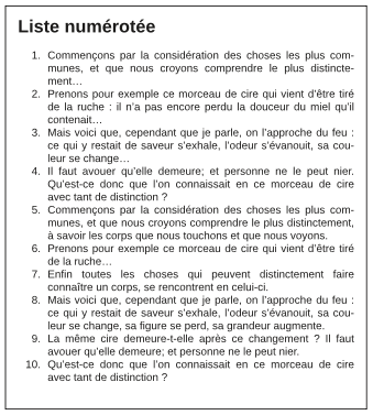
To accomplish this, first add two tabs for the number (in edit contents mode, you can simply click in the colored ruler space). Next, open the style editor (Edit > Styles), and modify the first tab to be a right tab, so that the numbers align properly. Then set the text body indentation for proper alignment. You will likely need to play with settings to get the look you wish. You can create multilayered lists by adding new styles, as shown below.
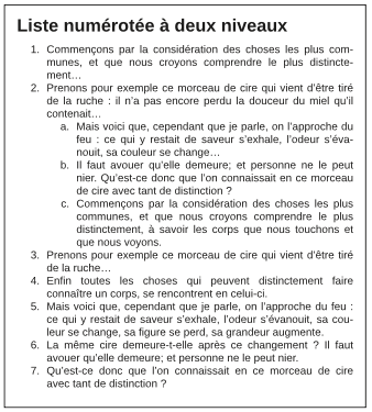
For bulleted lists, you will use a bullet glyph instead of numbers. Choose one from a symbol font.
Linespacing
The traditional printing term for linespacing is leading, since it involved adding lead spacers to achieve the desired alignment. Scribus has three linespacing modes.
Fixed linespacing uses a specific width which can be set by the user, and remains constant regardless of font size.
Automatic linespacing adjusts the space according to the size of the font. The default setting for this is 120% of the font size, but this can be adjusted in File > Preferences > Typography. Notice that this setting is actually what will be added to 100%. Because of the variability of the result according to font size, professionals typically do not use this type of spacing.
Align to Baseline Grid is a setting you will find in File > Preferences > Guides, in the lower right corner of the dialog. This is a document-wide setting, which forces text alignment for all frames on all pages where it is used for the chosen font or style. There is only one possible setting for an entire document.
In the example below you see the baseline grid, which you can show or hide with View > Show Baseline Grid, and see that the body text aligns to the grid. In contrast, the heading style is not set to align to the Grid, so you can expect to make some adjustments for proper spacing above and below. What this demonstrates is the flexibility you have combining font sizes and styles.
The setting Default width for space will adjust the space between groups of words. When used in a heading, it can reduce excessive space and thus emphasize the contrast for the title. in the body of a paragraph can adjust the typographical gray appearance, or adjust for widow and orphan lines.
Tracking is used for fine-tuning the space between individual letters, perhaps even just two particular letters. It is commonly used in large size headings, where the space which was designed for a much smaller font size becomes distorted as one enlarges the font. Once you use font sizes greater than 16 points, this will become more obvious.
The above example shows text in Liberation Sans Bold 80 pts. On top, automatic linespacing at 120% was used, and no adjustments were made to between word and between letter spacing. The bottom version shows an adjustment to fixed linespacing of 73 pts, and the default width for space adjusted to -5%. Bringing this to a overall more compact appearance causes a greater emphasis of this text.
To adjust tracking, go to Properties > Text > Advanced Settings and look for the icon prominently showing AV. The correct setting is what you find most pleasing in appearance, and therefore is highly subjective. Beware that settings that work best on a particular font at a particular size cannot be generalized for other fonts and other sizes, so each time you must again adjust to your preference.
To use Default width for space you will typically be highlighting text you wish to adjust.
For Tracking you will be more likely placing the cursor between two letters, since this is usually used only where needed, and as much as needed in each place.
Multilingual documents: what can and can't Scribus do?
It's certainly possible to create documents with a mixture of languages, not just on the same page but even in the same frame. There are some limitations, however, which we indicate below.
- Although there is support for right-to-left languages, Scribus has severe problems with Arabic. Individual glyphs can certainly be entered into a text frame using an appropriate font, but the problem comes down to various ligature glyphs and termination lines, and this has not yet been resolved.
- Other languages written right to left can also be managed, but Scribus may not appropriately handle diacritical marks. Therefore make some tests before beginning some large document with such languages.
- Indic languages have complex changes which occur with certain letter sequences and combinations, and therefore also are not yet supported.
- Some good news is that languages using the Cyrillic alphabet such as Russian, nor are there problems with Slavic and other eastern European languages which use an extended Latin alphabet.
- Vietnamese (Tiếng Việt), because of its many diacritics, can present some problems, but Scribus should be able to handle this southeast Asian language, since it is written with a modified Latin character set. The main issue will be having these glyphs in your chosen font, so some testing is necessary to avoid problems.
- African languages which use a Latin alphabet should pose no difficulties with Scribus. Here again, one must make sure that a chosen font can appropriately handle the required glyphs. With OTF fonts, it may be possible to add certain necessary glyphs if you have the appropriate software, and the font license allows you to do so.
In any of the situations where you may reach a roadblock as indicated above, you may be able to create a workaround with a word processor which can manage these languages, then create a PDF or other image file which you can use in Scribus. This is certainly not ideal, but may represent the only practical approach.
In some cases, you may be creating a document in several language versions, with no two languages being present in the same version. Here you have two ways of managing this. The first would be to make a copy, then replace the original text with the text using the new language, and thus you create more than one document.
The other possibility if you have thought about it ahead, is to place the different languages each on their own layer but duplicating layers, then changing the text on the cloned layer. When you are ready to create the PDF, make only the desired layer visible and printable as you export.
It's also worth noting here that the Scribus interface has been translated to 40 languages, and the number continues to grow.
Some African languages which Scribus can manage
- Hause
- Fulfulde
- Zama
- Tamajaq
- Kanuri
- Gourmanchéma
- Tubu
- and some others
Various Indo-European languages Scribus can manage
- French
- English
- German
- Spanish
- Italian
- Polish
- Russian
- and many others
Automatic page numbering
Scribus can insert page numbers automatically. To do this in the recommended way, you should create a Master Page (Edit > Master Page). Insert a text frame and position where you want your page number to be. Go to Edit Contents mode by clicking the icon on the toolbar (the one with a capital A and a cursor beside it), or simply double-click inside the frame. Now Insert > Character > Page Number Now choose the font and its size, color and any other settings, plus add any other text you wish to accompany the number, for example the name of the publication. If needed, you can then copy the Master Page and modify for right or left pages. Close the dialog and the page number will appear on every page where that Master Page is used.
Hyphenation
Hyphenation of words might be completely avoided for some kinds of publications. However, if you are using full justification, you may not be able to avoid large white spaces between words without hyphenation, thus breaking up the smooth typographical gray appearance you would like to achieve. You will find the reader's eye is irresistibly drawn to these white spaces, disrupting the flow of reading the text. Unless they are excessive, usually hyphenation poses less problem with smooth reading than large spaces within a line. Therefore, most publications use hyphenation to some extent.
To use hyphenation, first go to File > Preferences > Hyphenation and Spelling. You should leave the boxes Hyphenation Suggestions and Hyphenate Automatically During Typing unchecked, to avoid dialogs repeatedly coming up and changes needing to be made. In contrast, the other selections about hyphenation language, smallest word to hyphenate, and limitations on the number of consecutive lines to be hyphenated should be edited to your needs.
The hyphenation language speaks for itself. In general, the smallest word to hyphenate might be 5 or 6 letters for most uses, but in a column of text which is quite wide or in a small amount of text you might increase this to 7 to 10. The number of consecutive lines to hyphenate is again straightforward, and should be adjusted to the context of your layout.
Something else worth knowing is that Scribus does not include hyphenation settings in Paragraph Styles. It might seem that this means that you cannot use different settings for different frames in a document, but it is possible, albeit a bit challenging. Once hyphenation has been applied to a given frame, it will not change even though you might subsequently change settings in Preferences. The main problem can be coordinating the settings for the different frames. If you might subsequently undo hyphenation then set it again, or edit text in a previously hyphenated frame, current settings will be applied. Although this can create its own difficulties, at least the method can be adapted. It's also possible to add exceptions to hyphenation as you like in the Preferences settings.
Once you have your rules and settings, you then apply those rules for your frames with Extras > Hyphenate Text.
Widows and Orphans
Late in your production workflow is when you can begin to tackle problems such as widows and orphans, those fragments at the head (widow) or foot (orphan) of some page or column.
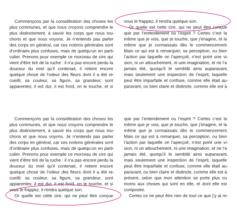
The reason for waiting until some late stage is that you want to have accomplish most if not all of your text edits, since widow and orphans may come and go as you add or change text. Sometimes even a very small change in text produces dramatic changes in layout of the text. In the end, you have little to gain by rushing this stage.
Scribus does not automatically manage widows and orphans, yet it has all the tools you need to deal with them. Depending on the type of publication, you might use coarser or finer adjustments to bring a widow to the previous column or send an orphan to the next. If your document is in a journal, where the life of the information is short, appearance may be less critical than in a book or other publication designed for a long time of use.
- First, check to see that text has been already been handled reasonably well, hyphenation applied, so that you don't have big white spaces or white space rivers anywhere. Fix the typographical gray before dealing with widows and orphans.
- Next, check the text before and after widow and orphan problems, looking for places where either adjusting tracking or white space between words might have the least impact. However this is done, the goal is to maintain the desired typographical gray appearance – no sense in solving one problem by creating another. Selecting a paragraph which has the least amount text on the last line, use tracking and space adjustment between words to eliminate that short ending line.
- If this is unsuccessful, other methods should be used but with great restraint. Under Properties > Text > Advanced Settings, decrease the width of characters, perhaps no more than 1 to 2% less. For a paragraph-sized amount of text, even such small changes should affect length of lines yet not be noticeable by the reader.
- In case you don't wish to go as far as changing the scaling of the glyphs, then add an empty line to move an orphan to the next column or page. This empty white space will be less distracting than the orphan. Add a carriage return or page break before the orphan.
- Do not adjust the linespacing except as a last resort. Although newspapers sometimes use this method, this is quite unacceptable in a book. You would have to unselect Align to Baselne Grid in order to accomplish this.
- Edit the text content. This can work well if it is acceptable to the author.
- Add or adjust graphical elements or adjust captions and borders.
- See if there are headings which might be split into two lines to push the orphan. Conversely, reduce a two-line heading to one in the case of a widow.
- Finally, work on the white space. Perhaps the space above or below a heading can be adjusted in their styles with space before and after paragraphs. The total of both should match the leading value.
Text in an irregular space
Your creativity has few bounds with Scribus. Text frames can take any shape, and thus are not required to be rectangular. This will be discussed in Advanced Typography. Before moving on to that chapter, realize that Scribus has many more options up its sleeve. You can create shapes then use them as text frames. First, insert a shape or polygon (Insert > Insert Shape or Insert > Insert Polygon), then from the menu choose Item > Convert to ... > Text frame. Afterward, insert text. You can even insert text into a large letter shape by creating a large letter, then Convert to ... > Outlines, then Convert to ... > Text Frame, then inserting text. For the best results, choose the size of the original letter as well as the size of the text carefully. Once you see such examples, the possibilities are endless.
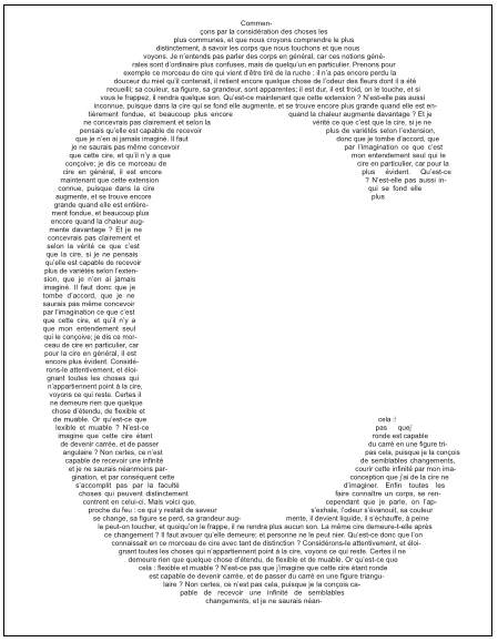
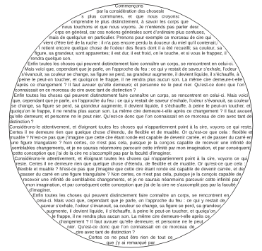
For best results in this second example, you might consider making the border color None.
Text on a path
To complete this introduction to text capabilities with Scribus, here is a simple effect with infinite variations – Scribus can put a attach a line of text to a path. Begin by making a text frame with a small amount of text. Now create a Bezier curve of some arbitrary shape. (See the Glossary for more information on Bezier curves.) With Shift held down, select the text frame, then the curve, so that both are selected. Finally, select Item > Attach Text to Path from the menu, and the results are automatic. What could be more simple than that?
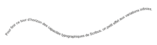
What's more, you can edit the text or the curve even after they are combined. To edit the text you can use Story Editor. To edit the shape, select the path, then from Properties > Shape select Edit.
This brings up the following dialog to edit the shape.
Now edit as you wish, then when finished, click End Editing.
