


Typography and Scribus
We now approach the core of Scribus. The ability to handle advanced features of typography is an absolute essential requirement of professional-quality DTP, and an area where Scribus excels.
First of all, we would point out that you will find an array of settings available in the Properties palette, and some additional features elsewhere, such as in the Styles Editor, and you should consider these complementary to each other for your needs.
Text as a process
Consider that page layout is a carefully arranged display or staging of your content. First, you wish to capture the eye of your reader, then guide him through the page in an organized way. If organization is lacking, if there is no cohesive idea to the layout, the reader has trouble grasping the content and quickly loses interest. Loss of interest means you have lost the message you were trying to transmit.
This is why there is a certain hierarchy to text. This doesn't mean there is a static structure that you use every time, but the designer nonetheless creates some sort of order in the way that the text is handled and presented. Here we are not going to make a case for some particular pattern or choices, but rather discuss the various choices you have available to you within Scribus.
Below is a list of various choices which might occur in publications. While it's not so likely to use all of these in any given design, typically a number of these will be used. If you look at various publications at your disposal, you should see many of these in action.
- Body text
- Photo or illustration legends
- Credits
- Headings
- Headlines
- Titles and subtitles
- Epigraphs
- Citations
- Indented text
- Bulleted lists
- Numbered lists
- Footnotes
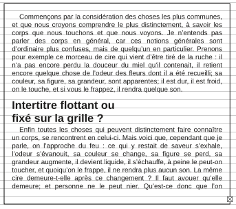
What you will find is that each of these categories has certain typographic characteristics. Your job as designer is to determine these various attributes. This isn't a matter of having some predetermined formula, yet as we have said, there must be a hierarchy in the appearance. For example, the title should be prominent have some punch to it to grab the reader. Titles and subtitles should offer some interesting contrast from the headlines. You can't necessarily consider the text in a strictly linear way, to be read top to bottom, start to finish, but rather allow for the reader to capture some context, and the typographic features guiding him along. You may use color, contrast, shadows, and even white space, hopefully in subtle ways, to keep the reader's interest.
The areas of body text are the quiet areas of the layout, which promote ease of reading without leading to visual fatigue. Headings, titles, and illustrations and captions function to help break up the monotony of the text and keep the reader's interest.
Typographic attributes
What follows are the various aspects of your typographic palette. Consider them to be the contents of your toolbox to showcase your text. Try not to remain in your comfort zone, but experiment with all of them so that you become familiar with their implementation.
The drop cap
Drop caps will be something of a show piece of your layout. The reader's eye will be drawn to this large first letter of a paragraph, which will likely be bold, and may even have a different typeface and color from the body text. While there are ways to artificially create drop caps, the most convenient way is to create this as part of a paragraph style. Simply check Drop Caps, then select the number of lines you wish the drop cap to cover. Adjust Distance from Text as desired. Since this paragraph style applies to the entire paragraph, if you wish to change the font or its color only for the drop cap, you will need to do this from the Properties palette by highlighting letter and editing.
A recommendation to consider is that in addition you edit the remainder of the first word of the paragraph so that it is in small caps. In the case of the first word being an article such as A or The, then also make the next word small caps. The Properties palette has a setting for small caps, but a few fonts will also have a small caps style, the more preferable alternative. Note the difference in the examples below.
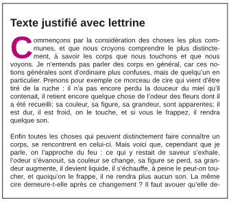
A final note of caution about drop caps – don't overuse them. Do not use your drop cap style in every paragraph of body text, maybe only the first paragraph of a multiparagraph or multipage article. For this reason make a separate modified version with drop caps of your main body text paragraph style, so you apply it sparingly.
Ligatures are a special glyph combining certain combinations of adjacent letters, such as "œ" for example. In order to use these, you must have these special glyphs in your chosen typeface. While they can be entered directly if your keyboard allows, if you know the Unicode value, press Ctrl+Shift+U, then enter the 4-digit Unicode number (such as 00e6 for œ). Otherwise, you can from the menu Insert > Glyph, then find your glyph by that method. Once you find it, notice that Scribus shows a tooltip with the Unicode value you might use the next time.
Old style numerals, typically set below the baseline, are an uncommon glyph, so therefore you must see whether your chosen font includes these. From the menu, Insert > Glyph.
The settings for superscripts and subscripts are found in File > Preferences > Typography. Here you have two settings, one for displacement, the other for percentage scaling of the letter or number. There is only one setting allowed for each, so that this will be applied globally for all instances.
Quotes and apostrophes require special attention. These are not the similar characters which you might enter from your keyboard, but rather, specific typographic curved forms. There are specific left and right versions, and each language uses its own versions of these. If you are importing an ODT file, for example, these conversions may have already been made. Otherwise, you should convert these with Insert > Quote, where you will see the full range of possible choices. There is also an included script, Autoquote, which you may find useful for automatically converting typewriter quotes to typographical quotes.
Typographical spaces
If you look at the list which you see with Insert > Space, you may be surprised at the large number of different choices you have for something as "simple" as a space. Two which are commonly in use are thin spaces and non-breaking spaces. When you want thin spaces, unfortunately this is a manual operation, where you must insert each, one at a time. You might use this as a manual form of microtypography.
For non-breaking spaces, you have a powerful tool at your disposal, which you can apply with Extras > Short Words. Before using it, you should check File > Preferences > Short Words, where under your chosen language you will find a list of short words or abbreviations which will be searched for and the rule applied, such as in the French examples below. For example, if "Dr. " is encountered, the plugin ensures that a non-breaking space is placed between the title and the person's name, so these are not inadvertently separated by a line break. Similarly, a number followed by " kg" would not separate the number and its units.
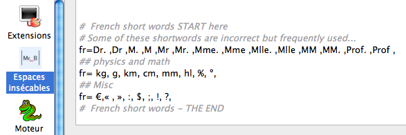
The structure of the list is that each entry must be followed by a comma, and furthermore must include a space which will indicate where the non-breaking space is to be placed. Therefore, we see a space after Dr., and a space before kg. If you don't agree with any of these you can change them, but don't forget to save your edits. You can of course also choose not to apply this plugin with Extras > Short Words.
If you do make what you consider important changes in this file in Preferences, you might share this on http://bugs.scribus.net so that others might make the same modifications.
Alignment and justification
There are 5 kinds of justification or alignment in Scribus. Just below the button for linespacing are the icon buttons for selecting your alignment, mostly intuitive, except for the fifth one, which we will explain here. You may select justification either in Properties > Text or in Edit > Styles, or in Story Editor.
Left alignment – this is suitable for titles and headings.
Right alignment – might be used for an author's name after a block of text.
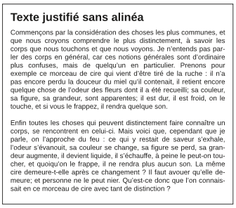
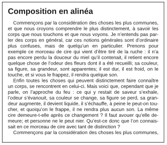
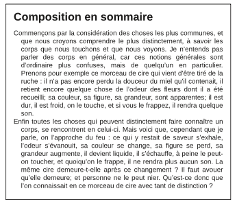
Justification – this refers to arranging the letters on the lines of paragraphs so that they fill the line edge to edge. In printing, we may describe justification according to the width of a column, for example, we might say that the text is justified for x picas. The icon for full justification depicts how the text fills the lines to the left and right edges, with the exception of the last line, which aligns either to the left or right, depending on the direction appropriate for a given language. This is the typical method used for magazines and newspapers, and allows for easy legibility and readability. Columns of text have something of a visual monotony, which helps one see the information in blocks highlighted by the titles or headings. We can also appreciate that from full justification comes the term typographical gray, to refer to a sense of the overall darkness or grayness of a block of text. Thus these areas of visual calm and gray appearance allow the headings and graphics to stand out and capture our attention.
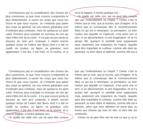
The three examples below illustrate uses of full justification. Notice that in the example where there is no indentation that extra space is created between paragraphs – this can only be achieved with the creation of Paragraph Styles, which is only possible through the Style Editor. In addition, indentation or hanging indentation can only be created with Paragraph Styles in the Style Editor.
Three variants using justified text
To obtain a hanging indentation such as in the last example (Composition en sommaire), you must first indent the body of the paragraph some positive value, then indent the first line of the paragraph some negative amount, whose absolute value is no greater than the indentation of the body.
It is essential to familiarize yourself with these various settings, so that you can combine them as needed to achieve your desired effect. For example, in situations where you may place a quote or summary in a block of text, you may wish to set apart with some extra space before and after the paragraph.
The fifth choice, forced justification, is something of a trap for some people. In this case, even the last line of your paragraph is fully justified, created a solid rectangular block of text. This might be used for some special effect, but rarely used in practice.
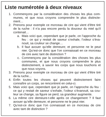
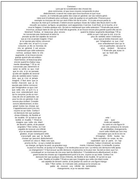
Numbered list, bulleted lists
Scribus has facility for creating lists, but this must be set up manually, using a Paragraph Style. The example below required setting four parameters: setting two tabs, indentation of the first line, and further indentation of the body of the paragraph. Details follow the graphic.
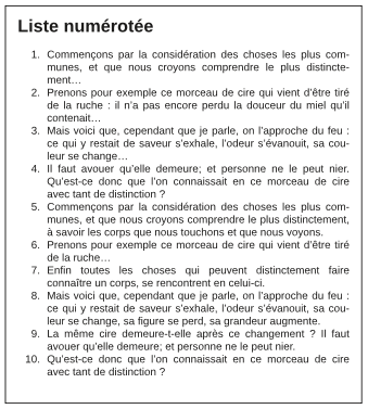
To accomplish this, first add two tabs for the number (in edit contents mode, you can simply click in the colored ruler space). Next, open the style editor (Edit > Styles), and modify the first tab to be a right tab, so that the numbers align properly. Then set the text body indentation for proper alignment. You will likely need to play with settings to get the look you wish. You can create multilayered lists by adding new styles, as shown below.
For bulleted lists, you will use a bullet glyph instead of numbers. Choose one from a symbol font.
Linespacing
The traditional printing term for linespacing is leading, since it involved adding lead spacers to achieve the desired alignment. Scribus has three linespacing modes.
Fixed linespacing uses a specific width which can be set by the user, and remains constant regardless of font size.
Automatic linespacing adjusts the space according to the size of the font. The default setting for this is 120% of the font size, but this can be adjusted in File > Preferences > Typography. Notice that this setting is actually what will be added to 100%. Because of the variability of the result according to font size, professionals typically do not use this type of spacing.
Align to Baseline Grid is a setting you will find in File > Preferences > Guides, in the lower right corner of the dialog. This is a document-wide setting, which forces text alignment for all frames on all pages where it is used for the chosen font or style. There is only one possible setting for an entire document.
In the example below you see the baseline grid, which you can show or hide with View > Show Baseline Grid, and see that the body text aligns to the grid. In contrast, the heading style is not set to align to the Grid, so you can expect to make some adjustments for proper spacing above and below. What this demonstrates is the flexibility you have combining font sizes and styles.
The setting Default width for space will adjust the space between groups of words. When used in a heading, it can reduce excessive space and thus emphasize the contrast for the title. in the body of a paragraph can adjust the typographical gray appearance, or adjust for widow and orphan lines.
Tracking is used for fine-tuning the space between individual letters, perhaps even just two particular letters. It is commonly used in large size headings, where the space which was designed for a much smaller font size becomes distorted as one enlarges the font. Once you use font sizes greater than 16 points, this will become more obvious.
The above example shows text in Liberation Sans Bold 80 pts. On top, automatic linespacing at 120% was used, and no adjustments were made to between word and between letter spacing. The bottom version shows an adjustment to fixed linespacing of 73 pts, and the default width for space adjusted to -5%. Bringing this to a overall more compact appearance causes a greater emphasis of this text.
To adjust tracking, go to Properties > Text > Advanced Settings and look for the icon prominently showing AV. The correct setting is what you find most pleasing in appearance, and therefore is highly subjective. Beware that settings that work best on a particular font at a particular size cannot be generalized for other fonts and other sizes, so each time you must again adjust to your preference.
To use Default width for space you will typically be highlighting text you wish to adjust.
For Tracking you will be more likely placing the cursor between two letters, since this is usually used only where needed, and as much as needed in each place.
Multilingual documents: what can and can't Scribus do?
It's certainly possible to create documents with a mixture of languages, not just on the same page but even in the same frame. There are some limitations, however, which we indicate below.
- Although there is support for right-to-left languages, Scribus has severe problems with Arabic. Individual glyphs can certainly be entered into a text frame using an appropriate font, but the problem comes down to various ligature glyphs and termination lines, and this has not yet been resolved.
- Other languages written right to left can also be managed, but Scribus may not appropriately handle diacritical marks. Therefore make some tests before beginning some large document with such languages.
- Indic languages have complex changes which occur with certain letter sequences and combinations, and therefore also are not yet supported.
- Some good news is that languages using the Cyrillic alphabet such as Russian, nor are there problems with Slavic and other eastern European languages which use an extended Latin alphabet.
- Vietnamese (Tiếng Việt), because of its many diacritics, can present some problems, but Scribus should be able to handle this southeast Asian language, since it is written with a modified Latin character set. The main issue will be having these glyphs in your chosen font, so some testing is necessary to avoid problems.
- African languages which use a Latin alphabet should pose no difficulties with Scribus. Here again, one must make sure that a chosen font can appropriately handle the required glyphs. With OTF fonts, it may be possible to add certain necessary glyphs if you have the appropriate software, and the font license allows you to do so.
In any of the situations where you may reach a roadblock as indicated above, you may be able to create a workaround with a word processor which can manage these languages, then create a PDF or other image file which you can use in Scribus. This is certainly not ideal, but may represent the only practical approach.
In some cases, you may be creating a document in several language versions, with no two languages being present in the same version. Here you have two ways of managing this. The first would be to make a copy, then replace the original text with the text using the new language, and thus you create more than one document.
The other possibility if you have thought about it ahead, is to place the different languages each on their own layer but duplicating layers, then changing the text on the cloned layer. When you are ready to create the PDF, make only the desired layer visible and printable as you export.
It's also worth noting here that the Scribus interface has been translated to 40 languages, and the number continues to grow.
Some African languages which Scribus can manage
- Hause
- Fulfulde
- Zama
- Tamajaq
- Kanuri
- Gourmanchéma
- Tubu
- and some others
Various Indo-European languages Scribus can manage
- French
- English
- German
- Spanish
- Italian
- Polish
- Russian
- and many others
Automatic page numbering
Scribus can insert page numbers automatically. To do this in the recommended way, you should create a Master Page (Edit > Master Page). Insert a text frame and position where you want your page number to be. Go to Edit Contents mode by clicking the icon on the toolbar (the one with a capital A and a cursor beside it), or simply double-click inside the frame. Now Insert > Character > Page Number Now choose the font and its size, color and any other settings, plus add any other text you wish to accompany the number, for example the name of the publication. If needed, you can then copy the Master Page and modify for right or left pages. Close the dialog and the page number will appear on every page where that Master Page is used.
Hyphenation
Hyphenation of words might be completely avoided for some kinds of publications. However, if you are using full justification, you may not be able to avoid large white spaces between words without hyphenation, thus breaking up the smooth typographical gray appearance you would like to achieve. You will find the reader's eye is irresistibly drawn to these white spaces, disrupting the flow of reading the text. Unless they are excessive, usually hyphenation poses less problem with smooth reading than large spaces within a line. Therefore, most publications use hyphenation to some extent.
To use hyphenation, first go to File > Preferences > Hyphenation and Spelling. You should leave the boxes Hyphenation Suggestions and Hyphenate Automatically During Typing unchecked, to avoid dialogs repeatedly coming up and changes needing to be made. In contrast, the other selections about hyphenation language, smallest word to hyphenate, and limitations on the number of consecutive lines to be hyphenated should be edited to your needs.
The hyphenation language speaks for itself. In general, the smallest word to hyphenate might be 5 or 6 letters for most uses, but in a column of text which is quite wide or in a small amount of text you might increase this to 7 to 10. The number of consecutive lines to hyphenate is again straightforward, and should be adjusted to the context of your layout.
Something else worth knowing is that Scribus does not include hyphenation settings in Paragraph Styles. It might seem that this means that you cannot use different settings for different frames in a document, but it is possible, albeit a bit challenging. Once hyphenation has been applied to a given frame, it will not change even though you might subsequently change settings in Preferences. The main problem can be coordinating the settings for the different frames. If you might subsequently undo hyphenation then set it again, or edit text in a previously hyphenated frame, current settings will be applied. Although this can create its own difficulties, at least the method can be adapted. It's also possible to add exceptions to hyphenation as you like in the Preferences settings.
Once you have your rules and settings, you then apply those rules for your frames with Extras > Hyphenate Text.
Widows and Orphans
Late in your production workflow is when you can begin to tackle problems such as widows and orphans, those fragments at the head (widow) or foot (orphan) of some page or column.
The reason for waiting until some late stage is that you want to have accomplish most if not all of your text edits, since widow and orphans may come and go as you add or change text. Sometimes even a very small change in text produces dramatic changes in layout of the text. In the end, you have little to gain by rushing this stage.
Scribus does not automatically manage widows and orphans, yet it has all the tools you need to deal with them. Depending on the type of publication, you might use coarser or finer adjustments to bring a widow to the previous column or send an orphan to the next. If your document is in a journal, where the life of the information is short, appearance may be less critical than in a book or other publication designed for a long time of use.
- First, check to see that text has been already been handled reasonably well, hyphenation applied, so that you don't have big white spaces or white space rivers anywhere. Fix the typographical gray before dealing with widows and orphans.
- Next, check the text before and after widow and orphan problems, looking for places where either adjusting tracking or white space between words might have the least impact. However this is done, the goal is to maintain the desired typographical gray appearance – no sense in solving one problem by creating another. Selecting a paragraph which has the least amount text on the last line, use tracking and space adjustment between words to eliminate that short ending line.
- If this is unsuccessful, other methods should be used but with great restraint. Under Properties > Text > Advanced Settings, decrease the width of characters, perhaps no more than 1 to 2% less. For a paragraph-sized amount of text, even such small changes should affect length of lines yet not be noticeable by the reader.
- In case you don't wish to go as far as changing the scaling of the glyphs, then add an empty line to move an orphan to the next column or page. This empty white space will be less distracting than the orphan. Add a carriage return or page break before the orphan.
- Do not adjust the linespacing except as a last resort. Although newspapers sometimes use this method, this is quite unacceptable in a book. You would have to unselect Align to Baselne Grid in order to accomplish this.
- Edit the text content. This can work well if it is acceptable to the author.
- Add or adjust graphical elements or adjust captions and borders.
- See if there are headings which might be split into two lines to push the orphan. Conversely, reduce a two-line heading to one in the case of a widow.
- Finally, work on the white space. Perhaps the space above or below a heading can be adjusted in their styles with space before and after paragraphs. The total of both should match the leading value.
Text in an irregular space
Your creativity has few bounds with Scribus. Text frames can take any shape, and thus are not required to be rectangular. This will be discussed in Advanced Typography. Before moving on to that chapter, realize that Scribus has many more options up its sleeve. You can create shapes then use them as text frames. First, insert a shape or polygon (Insert > Insert Shape or Insert > Insert Polygon), then from the menu choose Item > Convert to ... > Text frame. Afterward, insert text. You can even insert text into a large letter shape by creating a large letter, then Convert to ... > Outlines, then Convert to ... > Text Frame, then inserting text. For the best results, choose the size of the original letter as well as the size of the text carefully. Once you see such examples, the possibilities are endless.
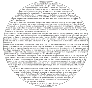
For best results in this second example, you might consider making the border color None.
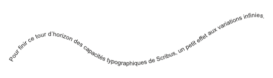
Text on a path
To complete this introduction to text capabilities with Scribus, here is a simple effect with infinite variations – Scribus can put a attach a line of text to a path. Begin by making a text frame with a small amount of text. Now create a Bezier curve of some arbitrary shape. (See the Glossary for more information on Bezier curves.) With Shift held down, select the text frame, then the curve, so that both are selected. Finally, select Item > Attach Text to Path from the menu, and the results are automatic. What could be more simple than that?
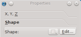
What's more, you can edit the text or the curve even after they are combined. To edit the text you can use Story Editor. To edit the shape, select the path, then from Properties > Shape select Edit.
This brings up the following dialog to edit the shape.
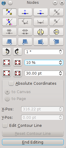
Now edit as you wish, then when finished, click End Editing.